---
title: "COVID Website"
description: |
  Welcome to the website. I hope you enjoy it!
site: distill::distill_website
---9 Websites
You are reading the free online version of this book. If you’d like to purchase a physical or electronic copy, you can buy it from No Starch Press, Powell’s, Barnes and Noble or Amazon.
During the summer of 2020, Matt Herman’s family moved from Brooklyn to Westchester County, New York. It was still early in the COVID-19 pandemic, and Herman was shocked that the county published little data about infection rates. Vaccines weren’t yet available, and daily choices like whether to go to the park depended on access to good data.
At the time, Herman was deputy director of the ChildStat Data Unit in the Office of Research and Analytics at the New York City Administration for Children’s Services. This mouthful of a title meant he was skilled at working with data, enabling him to create the COVID resource he needed: the Westchester COVID-19 Tracking website.
Built entirely in R, this website uses charts, maps, tables, and text to summarize the latest COVID data for Westchester County. The website is no longer updated daily, but you can still view it at https://westchester-covid.mattherman.info.
To make this website, Herman wrote a set of R Markdown files and strung them together with the distill package. This chapter explains the basics of the package by walking through the creation of a simple website. You’ll learn how to produce different page layouts, navigation menus, and interactive graphics, then explore strategies for hosting your website.
Creating a New distill Project
A website is merely a collection of HTML files like the one you produced in Chapter 8 when you created a slideshow presentation. The distill package uses multiple R Markdown documents to create several HTML files, then connects them with a navigation menu and more.
To create a distill website, install the package using install.packages("distill"). Then start a project in RStudio by navigating to File > New Project > New Directory and selecting Distill Website as the project type.
Specify the directory and subdirectory where your project will live on your computer, then give your website a title. Check the Configure for GitHub Pages option, which provides an easy way to post your website online (you’ll learn how it works in Section 9.6.2). Select it if you’d like to use this deployment option.
The Project Files
You should now have a project with several files. In addition to the covid-website.Rproj file indicating that you’re working in an RStudio project, you should have two R Markdown documents, a *_site.yml* file, and a docs folder, where the rendered HTML files will go. Let’s take a look at these website files.
R Markdown Documents
Each R Markdown file represents a page of the website. By default, distill creates a home page (index.Rmd) and an About page (about.Rmd) containing placeholder content. If you wanted to generate additional pages, you would simply add new R Markdown files, then list them in the *_site.yml* file discussed in the next section.
If you open the index.Rmd file, you’ll notice that the YAML contains two arguments, description and site, that didn’t appear in the R Markdown documents from previous chapters:
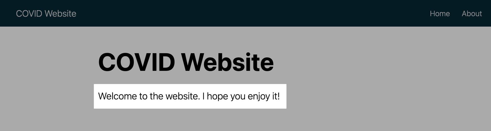
The description argument specifies the text that should go below the title of each page, as shown in Figure 9.1.
The site: distill::distill_website line identifies the root page of a distill website. This means that when you knit the document, R Markdown knows to create a website rather than an individual HTML file and that the website should display this page first. The other pages of the website don’t require this line. As long as they’re listed in the *_site.yml* file, they’ll be added to the site.
You’ll also notice the absence of an argument you’ve seen in other R Markdown documents: output, which specifies the output format R should use while knitting. The reason output is missing here is that you’ll specify the output for the entire website in the *_site.yml* file.
The _site.yml File
The *_site.yml* file tells R which R Markdown documents make up the website, what the knitted files should look like, what the website should be called, and more. When you open it, you should see the following code:
name: "covid-website"
title: "COVID Website"
description: |
  COVID Website
output_dir: "docs"
navbar:
  right:
    - text: "Home"
      href: index.html
    - text: "About"
      href: about.html
output: distill::distill_article
The name argument determines the URL for your website. By default, this should be the name of the directory where your distill project lives; in my case, that’s the covid-website directory. The title argument creates the title for the entire website and shows up in the top left of the navigation bar by default. The description argument provides what’s known as a meta description, which will show up as a couple of lines in Google search results to give users an overview of the website content.
The output_dir argument determines where the rendered HTML files live when you generate the website. You should see the docs directory listed here. However, you can change the output directory to any folder you choose.
Next, the navbar section defines the website’s navigation. Here it appears on the right side of the header, but swapping the right parameter for left would switch its position. The navigation bar includes links to the site’s two pages, Home and About, as shown in Figure 9.2.

Within the navbar code, the text argument specifies what text shows up in the menu. (Try, for example, changing About to About This Website, and then change it back.) The href argument determines which HTML file the text in the navigation bar links to. If you want to include additional pages on your menu, you’ll need to add both the text and href parameters.
Finally, the output argument specifies that all R Markdown documents should be rendered using the distill_article format. This format allows for layouts of different widths, asides (parenthetical items that live in a sidebar next to the main content), easily customizable CSS, and more.
Building the Site
We’ve explored the project’s files but haven’t yet used them to create the website. To do this, click Build Website in the Build tab of RStudio’s topright pane. (You could also run rmarkdown::render_site() in the console or in an R script file.)
This should render all R Markdown documents and add the top navigation bar to them with the options specified in the *_site.yml* file. To find the rendered files, look in docs (or whatever output directory you specified). Open the index.html file and you’ll find your website, which should look like Figure 9.3.

You can open any other HTML file as well to see its rendered version.
Applying Custom CSS with create_theme()
Websites made with distill tend to look similar, but you can change their design using custom CSS. The distill package even provides a function to simplify this process. Run distill::create_theme() in the console to create a file called theme.css, shown here:
/* base variables */

/* Edit the CSS properties in this file to create a custom
   Distill theme. Only edit values in the right column
   for each row; values shown are the CSS defaults.
   To return any property to the default,
   you may set its value to: unset
   All rows must end with a semi-colon.                      */

/* Optional: embed custom fonts here with `@import`          */
/* This must remain at the top of this file.                 */

html {
  /*-- Main font sizes --*/
  --title-size:      50px;
  --body-size:       1.06rem;
  --code-size:       14px;
  --aside-size:      12px;
  --fig-cap-size:    13px;
  /*-- Main font colors --*/
  --title-color:     #000000;
  --header-color:    rgba(0, 0, 0, 0.8);
  --body-color:      rgba(0, 0, 0, 0.8);
  --aside-color:     rgba(0, 0, 0, 0.6);
  --fig-cap-color:   rgba(0, 0, 0, 0.6);
  /*-- Specify custom fonts ~~~ must be imported above   --*/
  --heading-font:    sans-serif;
  --mono-font:       monospace;
  --body-font:       sans-serif;
  --navbar-font:     sans-serif;  /* websites + blogs only */
}

/*-- ARTICLE METADATA --*/
d-byline {
  --heading-size:    0.6rem;
  --heading-color:   rgba(0, 0, 0, 0.5);
  --body-size:       0.8rem;
  --body-color:      rgba(0, 0, 0, 0.8);
}

/*-- ARTICLE TABLE OF CONTENTS --*/
.d-contents {
  --heading-size:    18px;
  --contents-size:   13px;
}

/*-- ARTICLE APPENDIX --*/
d-appendix {
  --heading-size:    15px;
  --heading-color:   rgba(0, 0, 0, 0.65);
  --text-size:       0.8em;
  --text-color:      rgba(0, 0, 0, 0.5);
}

/*-- WEBSITE HEADER + FOOTER --*/
/* These properties only apply to Distill sites and blogs  */

.distill-site-header {
  --title-size:       18px;
  --text-color:       rgba(255, 255, 255, 0.8);
  --text-size:        15px;
  --hover-color:      white;
  --bkgd-color:       #0F2E3D;
}

.distill-site-footer {
  --text-color:       rgba(255, 255, 255, 0.8);
  --text-size:        15px;
  --hover-color:      white;
  --bkgd-color:       #0F2E3D;
}

/*-- Additional custom styles --*/
/* Add any additional CSS rules below                      */
Within this file is a set of CSS variables that allow you to customize the design of your website. Most of them have names that clearly show their purpose, and you can alter their default values to whatever you’d like. For example, the following edits to the site’s header make the title and text size larger and change the background color to a light blue:
.distill-site-header {
  --title-size:       28px;
  --text-color:       rgba(255, 255, 255, 0.8);
  --text-size:        20px;
  --hover-color:      white;
  --bkgd-color:       #6cabdd;
}
Before you can see these changes, however, you need to add a line to the *_site.yml* file to tell distill to use this custom CSS when rendering:
name: "covid-website"
title: "COVID Website"
description: |
  COVID Website
theme: theme.css
output_dir: "docs"
navbar:
  right:
    - text: "Home"
      href: index.html
    - text: "About"
      href: about.html
output: distill::distill_article
Now you can generate the site again, and you should see your changes reflected.
There are a lot of other CSS variables in theme.css that you can change to tweak the appearance of your website. Playing around with them and regenerating your site is a great way to figure out what each one does.
Working with Website Content
You can add content to a page on your website by creating Markdown text and code chunks in the page’s R Markdown document. For example, to highlight rates of COVID cases over time, you’ll replace the contents of index.Rmd with code that displays a table, a map, and a chart on the website’s home page. Here’s the start of the file:
---
title: "COVID Website"
description: "Information about COVID rates in the United States over time"
site: distill::distill_website
---

```{r setup, include=FALSE}
knitr::opts_chunk$set(
  echo = FALSE,
  warning = FALSE,
  message = FALSE
)
```

```{r}
# Load packages

library(tidyverse)
library(janitor)
library(tigris)
library(gt)
library(lubridate)
```
After the YAML and setup code chunk, this code loads several packages, most of which you’ve seen in previous chapters: the tidyverse for data import, manipulation, and plotting (with ggplot); janitor for its clean_names() function, which makes the variable names easier to work with; tigris to import geospatial data about states; gt for making nice tables; and lubridate to work with dates.
Next, to import and clean the data, add this new code chunk:
```{r}
# Import data
us_states <- states(
cb = TRUE,
resolution = "20m",
progress_bar = FALSE
) %>%
shift_geometry() %>%
clean_names() %>%
select(geoid, name) %>%
rename(state = name) %>%
filter(state %in% state.name)
covid_data <- read_csv("https://raw.githubusercontent.com/nytimes/covid-19-data/master/rolling-averages/us-states.csv") %>%
filter(state %in% state.name) %>%
mutate(geoid = str_remove(geoid, "USA-"))
last_day <- covid_data %>%
slice_max(
order_by = date,
n = 1
) %>%
distinct(date) %>%
mutate(date_nice_format = str_glue("{month(date, label = TRUE, abbr = FALSE)} {day(date)}, {year(date)}")) %>%
pull(date_nice_format)
```
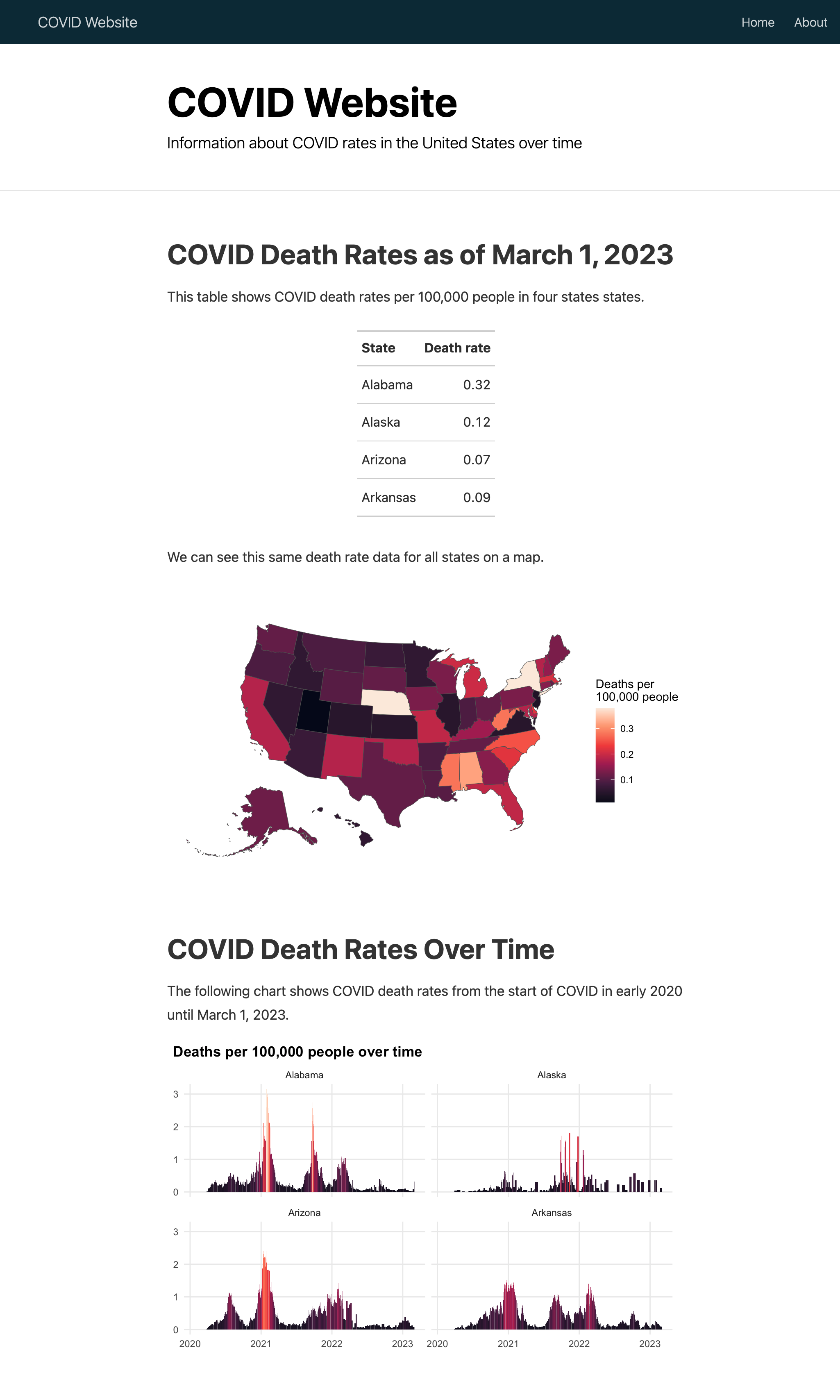
# COVID Death Rates as of `r last_day`This code uses the slice_max() function to get the latest date in the covid_data data frame. (Data was added until March 23, 2023, so that date is the most recent one.) From there, it uses distinct() to get a single observation of the most recent date (each date shows up multiple times in the covid_data data frame). The code then creates a date_nice_format variable using the str_glue() function to combine easy-to-read versions of the month, day, and year. Finally, the pull() function turns the data frame into a single variable called last_day, which is referenced later in a text section. Using inline R code, this header now displays the current date.
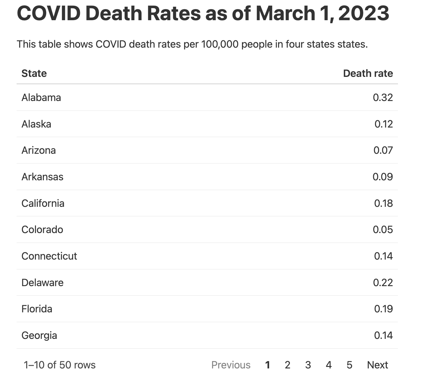
Include the following code to make a table showing the death rates per 100,000 people in four states (using all states would create too large a table):
```{r}
covid_data %>%
  filter(state %in% c(
    "Alabama",
    "Alaska",
    "Arizona",
    "Arkansas"
  )) %>%
  slice_max(
    order_by = date,
    n = 1
  ) %>%
  select(state, deaths_avg_per_100k) %>%
  arrange(state) %>%
  set_names("State", "Death rate") %>%
  gt() %>%
  tab_style(
    style = cell_text(weight = "bold"),
    locations = cells_column_labels()
  )
```
This table resembles the code you saw in Chapter 5. First, the filter() function filters the data down to four states, and the slice_max() function gets the latest date. The code then selects the relevant variables (state and deaths_avg_per_100k), arranges the data in alphabetical order by state, sets the variable names, and pipes this output into a table made with the gt package.
Add the following code, which uses techniques covered in Chapter 4, to make a map of this data for all states:
We can see this same death rate data for all states on a map.

```{r}
most_recent <- us_states %>%
  left_join(covid_data, by = "state") %>%
  slice_max(
    order_by = date,
    n = 1
  )

most_recent %>%
  ggplot(aes(fill = deaths_avg_per_100k)) +
  geom_sf() +
  scale_fill_viridis_c(option = "rocket") +
  labs(fill = "Deaths per\n100,000 people") +
  theme_void()
```
This code creates a most_recent data frame by joining the us_states geospatial data with the covid_data data frame before filtering to include only the most recent date. Then, it uses most_recent to create a map that shows deaths per 100,000 people.
Finally, to make a chart that shows COVID death rates over time in the four states from the table, add the following:
# COVID Death Rates Over Time

The following chart shows COVID death rates from the start of COVID in early 2020 until `r last_day`.

```{r}
covid_data %>%
  filter(state %in% c(
    "Alabama",
    "Alaska",
    "Arizona",
    "Arkansas"
  )) %>%
  ggplot(aes(
    x = date,
    y = deaths_avg_per_100k,
    group = state,
    fill = deaths_avg_per_100k
  )) +
  geom_col() +
  scale_fill_viridis_c(option = "rocket") +
  theme_minimal() +
  labs(title = "Deaths per 100,000 people over time") +
  theme(
    legend.position = "none",
    plot.title.position = "plot",
    plot.title = element_text(face = "bold"),
    panel.grid.minor = element_blank(),
    axis.title = element_blank()
  ) +
  facet_wrap(
    ~state,
    nrow = 2
  )
```
Using the geom_col() function, this code creates a faceted set of bar charts that show change over time by state (faceting was discussed in Chapter 2). Finally, it applies the rocket color palette, applies theme_minimal(), and makes a few tweaks to that theme. Figure 9.4 shows what the website’s home page looks like three years after the start of the pandemic.
Now that you have some content in place, you can tweak it. For example, because many states are quite small, especially in the Northeast, it’s a bit challenging to see them. Let’s look at how to make the entire map bigger.
Applying distill Layouts
One nice feature of distill is that it includes four layouts you can apply to a code chunk to widen its output: l-body-outset (creates output that is a bit wider than the default), l-page (creates output that is wider still), l-screen (creates full-screen output), and l-screen-inset (creates full-screen output with a bit of a buffer).
Apply l-screen-inset to the map by modifying the first line of its code chunk as follows:
```{r layout = "l-screen-inset"}This makes the map wider and taller and, as a result, much easier to read.
Making the Content Interactive
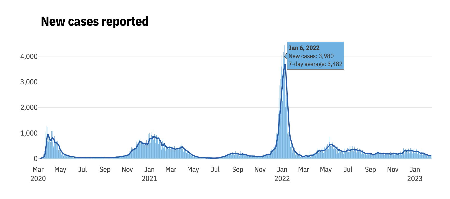
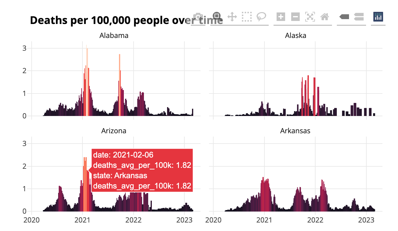
The content you’ve added to the website so far is all static; it has none of the interactivity typically seen in websites, which often use JavaScript to respond to user behavior. If you’re not proficient with HTML and JavaScript, you can use R packages like distill, plotly, and DT, which wrap JavaScript libraries, to add interactive elements like the graphics and maps Matt Herman uses on his Westchester County COVID website. Figure 9.5, for example, shows a tooltip that allows the user to see results for any single day.
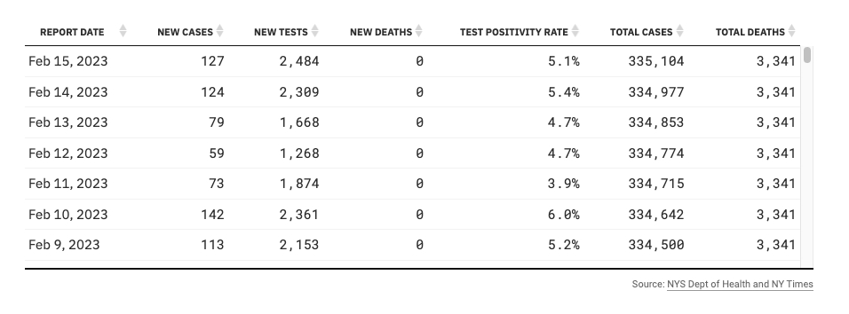
Using the DT package, Herman also makes interactive tables that allow the user to scroll through the data and sort the values by clicking any variable in the header, as shown in Figure 9.6.
Let’s add some interactivity to our national COVID website. We’ll begin by making our table interactive.
Adding Pagination to a Table with reactable
Remember how you included only four states in the table to keep it from getting too long? By creating an interactive table, you can avoid this limitation. The reactable package is a great option for interactive tables. First, install it with install.packages("reactable"). Then, swap out the gt package code you used to make your static table with the reactable() function to show all states:
The reactable package shows 10 rows by default and adds pagination, as shown in Figure 9.7.
The reactable() function also enables sorting by default. Although you used the arrange() function in your code to sort the data by state name, users can click the “Death rate” column to sort values using that variable instead.
Creating a Hovering Tooltip with plotly
Now you’ll add some interactivity to the website’s chart using the plotly package. First, install plotly with install.packages("plotly"). Then, create a plot with ggplot and save it as an object. Pass the object to the ggplotly() function, which turns it into an interactive plot, and run the following code to apply plotly to the chart of COVID death rates over time:
library(plotly)

covid_chart <- covid_data %>%
  filter(state %in% c(
    "Alabama",
    "Alaska",
    "Arizona",
    "Arkansas"
  )) %>%
  ggplot(aes(
    x = date,
    y = deaths_avg_per_100k,
    group = state,
    fill = deaths_avg_per_100k
  )) +
  geom_col() +
  scale_fill_viridis_c(option = "rocket") +
  theme_minimal() +
  labs(title = "Deaths per 100,000 people over time") +
  theme(
    legend.position = "none",
    plot.title.position = "plot",
    plot.title = element_text(face = "bold"),
    panel.grid.minor = element_blank(),
    axis.title = element_blank()
  ) +
  facet_wrap(
    ~state,
    nrow = 2
  )

ggplotly(covid_chart)
This is identical to the chart code shown earlier in this chapter, except that now you’re saving your chart as an object called covid_chart and then running ggplotly(covid_chart). This code produces an interactive chart that shows the data for a particular day when a user mouses over it. But the tooltip that pops up, shown in Figure 9.8, is cluttered and overwhelming because the ggplotly() function shows all data by default.
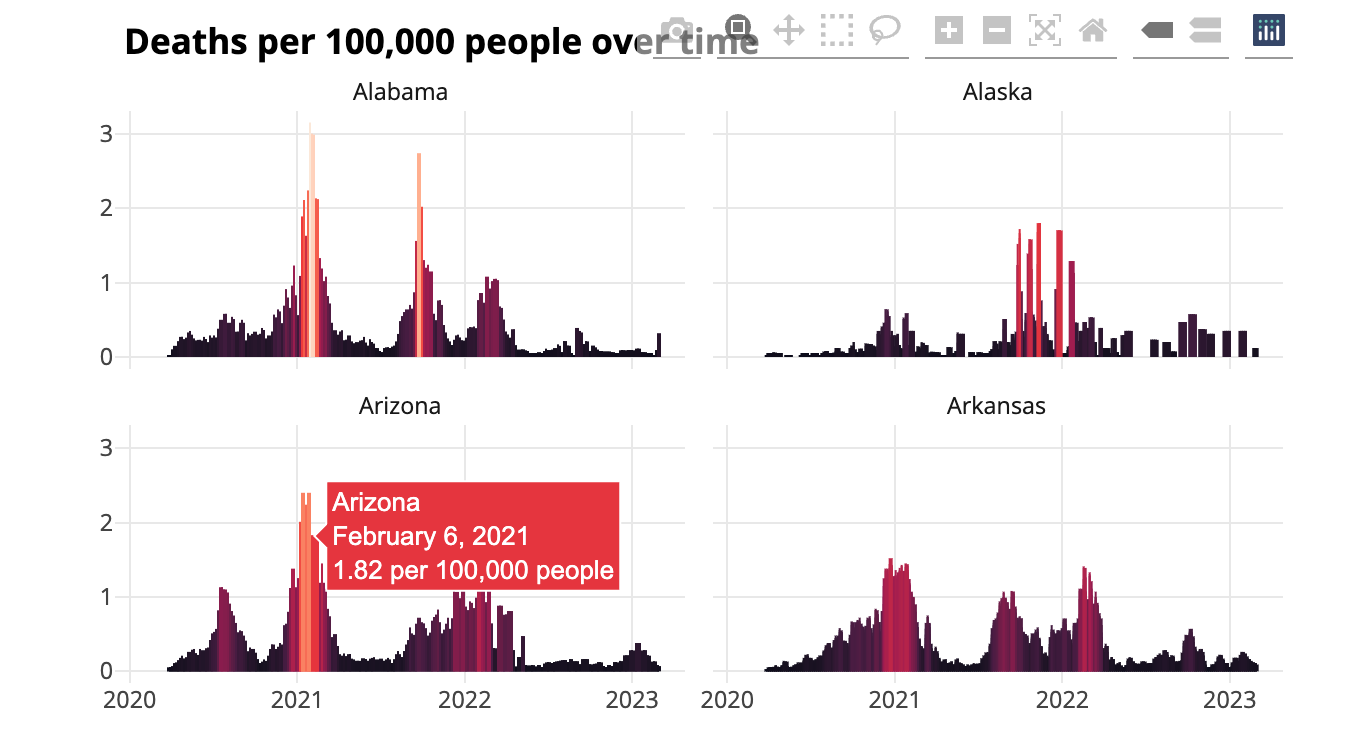
To make the tooltip more informative, create a single variable containing the data you want to display and tell ggplotly() to use it:
covid_chart <- covid_data %>%
  filter(state %in% c(
    "Alabama",
    "Alaska",
    "Arizona",
    "Arkansas"
  )) %>%
  mutate(date_nice_format = str_glue("{month(date, label = TRUE, abbr = FALSE)} {day(date)}, {year(date)}")) %>%
  mutate(tooltip_text = str_glue("{state}<br>{date_nice_format}<br>{deaths_avg_per_100k} per 100,000 people")) %>%
  ggplot(aes(
    x = date,
    y = deaths_avg_per_100k,
    group = state,
    text = tooltip_text,
    fill = deaths_avg_per_100k
  )) +
  geom_col() +
  scale_fill_viridis_c(option = "rocket") +
  theme_minimal() +
  labs(title = "Deaths per 100,000 people over time") +
  theme(
    legend.position = "none",
    plot.title.position = "plot",
    plot.title = element_text(face = "bold"),
    panel.grid.minor = element_blank(),
    axis.title = element_blank()
  ) +
  facet_wrap(
    ~state,
    nrow = 2
  )


ggplotly(
  covid_chart,
  tooltip = "tooltip_text"
)
This code begins by creating a date_nice_format variable that produces dates in the more readable format January 1, 2023, instead of 2023-01-01. This value is then combined with the state and death rate variables, and the result is saved as tooltip_text. Next, the code adds a new aesthetic property in the ggplot() function. This property doesn’t do anything until it’s passed to ggplotly().
Figure 9.9 shows what the new tooltip looks like: it displays the name of the state, a nicely formatted date, and that day’s death rate.
Adding interactivity is a great way to take advantage of the website medium. Users who might feel overwhelmed looking at the static chart can explore the interactive version, mousing over areas to see a summary of the results on any single day.
Hosting the Website
Now that you’ve made a website, you need a way to share it. There are various ways to do this, ranging from simple to quite complex. The easiest solution is to compress the files in your docs folder (or whatever folder you put your rendered website in) and email your ZIP file to your recipients. They can unzip it and open the HTML files in their browser. This works fine if you know you won’t want to make changes to your website’s data or styles. But, as Chapter 6 discussed, most projects aren’t really one-time events.
Cloud Hosting
A better approach is to put your entire docs folder in a place where others can see it. This could be an internal network, Dropbox, Google Drive, Box, or something similar. Hosting the files in the cloud this way is simple to implement and allows you to control who can see your website.
You can even automate the process of copying your docs folder to various online file-sharing sites using R packages: the rdrop2 package works with Dropbox, googledrive works with Google Drive, and boxr works with Box. For example, code like the following would automatically upload the project to Dropbox:
This code, which I typically add to a separate file called render.R, renders the site, uses the dir_ls() function from the fs package to identify all files in the docs directory, and then uploads these files to Dropbox. Now you can run your entire file to generate and upload your website in one go.
GitHub Hosting
A more complicated yet powerful alternative to cloud hosting is to use a static hosting service like GitHub Pages. Each time you commit (take a snap-shot of) your code and push (sync) it to GitHub, this service deploys the website to a URL you’ve set up. Learning to use GitHub is an investment of time and effort (the self-published book Happy Git and GitHub for the useR by Jenny Bryan at https://happygitwithr.com is a great resource), but being able to host your website for free makes it worthwhile.
Here’s how GitHub Pages works. Most of the time, when you look at a file on GitHub, you see its underlying source code, so if you looked at an HTML file, you’d see only the HTML code. GitHub Pages, on the other hand, shows you the rendered HTML files. To host your website on GitHub Pages, you’ll need to first push your code to GitHub. Once you have a repository set up there, go to it, then go to the Settings tab, which should look like Figure 9.10.
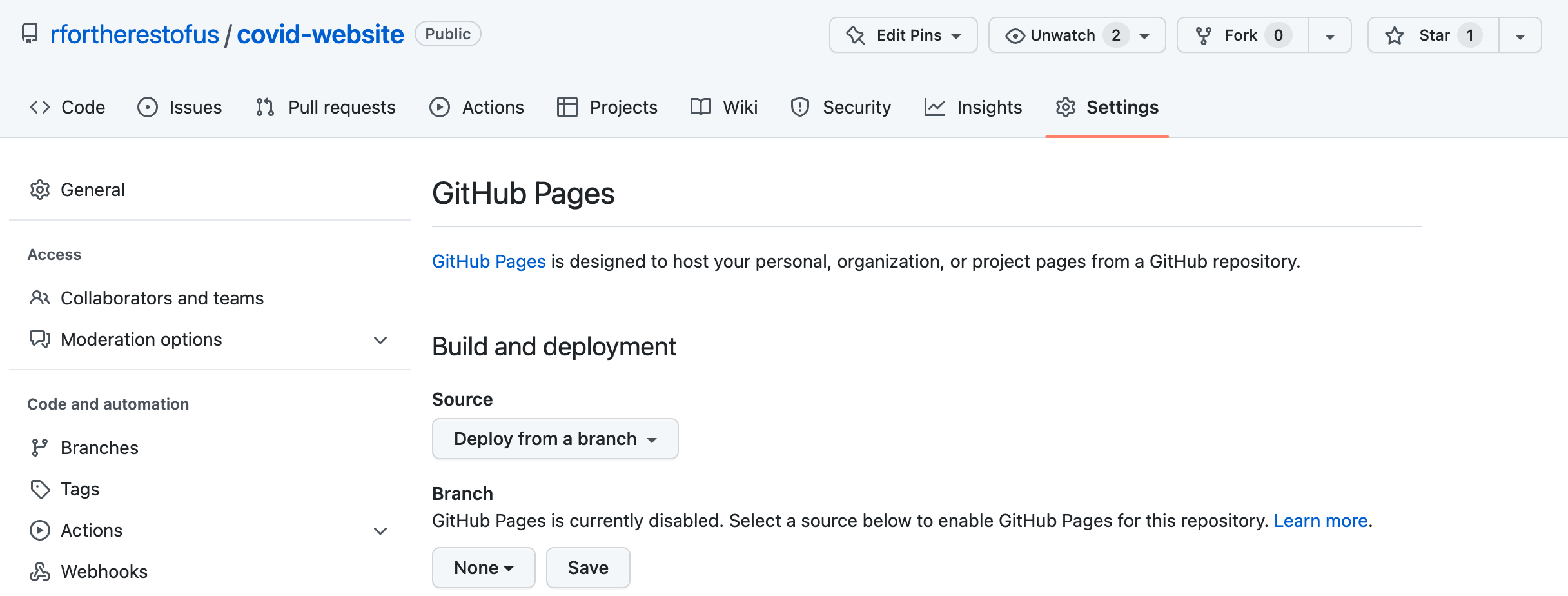
Now choose how you want GitHub to deploy the raw HTML. The easiest approach is to keep the default source. To do so, select Deploy from a branch and then select your default branch (usually main or master). Next, select the directory containing the HTML files you want to be rendered. If you configured your website for GitHub Pages at the beginning of this chapter, the files should be in docs. Click Save and wait a few minutes, and GitHub should show the URL where your website now lives.
The best part about hosting your website on GitHub Pages is that any time you update your code or data, the website will update as well. R Markdown, distill, and GitHub Pages make building and maintaining websites a snap.
Summary
In this chapter, you learned to use the distill package to make websites in R. This package provides a simple way to get a website up and running with the tool you’re already using for working with data. You’ve seen how to:
Create new pages and add them to your top navigation bar
Customize the look and feel of your website with tweaks to the CSS
Use wider layouts to make content fit better on individual pages
Convert static data visualization and tables into interactive versions
Use GitHub Pages to host an always-up-to-date version of your website
Matt Herman has continued building websites with R. He and his colleagues at the Council of State Governments Justice Center have made a great website using Quarto, the language-agnostic version of R Markdown. This website, found at https://projects.csgjusticecenter.org/tools-for-states-to-address-crime/, highlights crime trends throughout the United States using many of the same techniques you saw in this chapter.
Whether you prefer distill or Quarto, using R is a quick way to develop complex websites without having to be a sophisticated frontend web developer. The websites look good and communicate well. They are one more example of how R can help you efficiently share your work with the world.
Additional Resources
Consult the following resources to learn how to make websites with the distill package and to see examples of other websites made with distill:
The Distillery, “Welcome to the Distillery!,” accessed November 30, 2023, https://distillery.rbind.io.
Thomas Mock, “Building a Blog with distill,” The MockUp, August 1, 2020, https://themockup.blog/posts/2020-08-01-building-a-blog-with-distill/.