2 Use General Principles of High-Quality Data Viz in R
In the spring of 2021, nearly all of the American West was in a drought. In April of that year, officials in Southern California declared a water emergency, citing unprecedented conditions.
This wouldn’t have come as news to those living in California and other Western states. In addition to the direct impact of drought (leading areas of California to implement water use restrictions), people could see the indirect impact of drought in the skies. With forests dried out by years of drought conditions, wildfires became more frequent, filling the air with smoke. By the summer, there were be so many wildfires that smoke from drifted across the country, making even East Coast skies hazy and the air dangerous to breathe.
Drought conditions like those in the West in 2021 are becoming increasingly common. Yet communicating the extent of problem remains difficult. How can we show the data in a way that accurately represents the data while is also compelling enough to get people to take notice?
This was the challenge that data visualization designers Cédric Scherer and Georgios Karamanis took on in the fall of 2021. Commissioned by the magazine Scientific American to create a data visualization of drought conditions in the last two decades in the United States, they turned to the ggplot2 package to turn what could be (pardon the pun) dry data into a visually arresting and impactful graph.
There was nothing unique about the data that Cédric and Georgios used. It was the same data from the National Drought Center that news organizations used in their stories. But Cédric and Georgios visualized the data in a way that it both grabs attention and communicates the scale of the phenomenon.
Below is a section of the final visualization (If you’re incredibly eagle-eyed, you’ll see a few minor elements that differ from the version published in Scientific American). These are things I had to change to make the plots fit in this book (e.g. text size and putting legend text on two rows) or things that Scientific American added in post-production (e.g. some annotations). Showing four regions over the last two decades, the increase in drought conditions, especially in California and the Southwest, is made apparent.
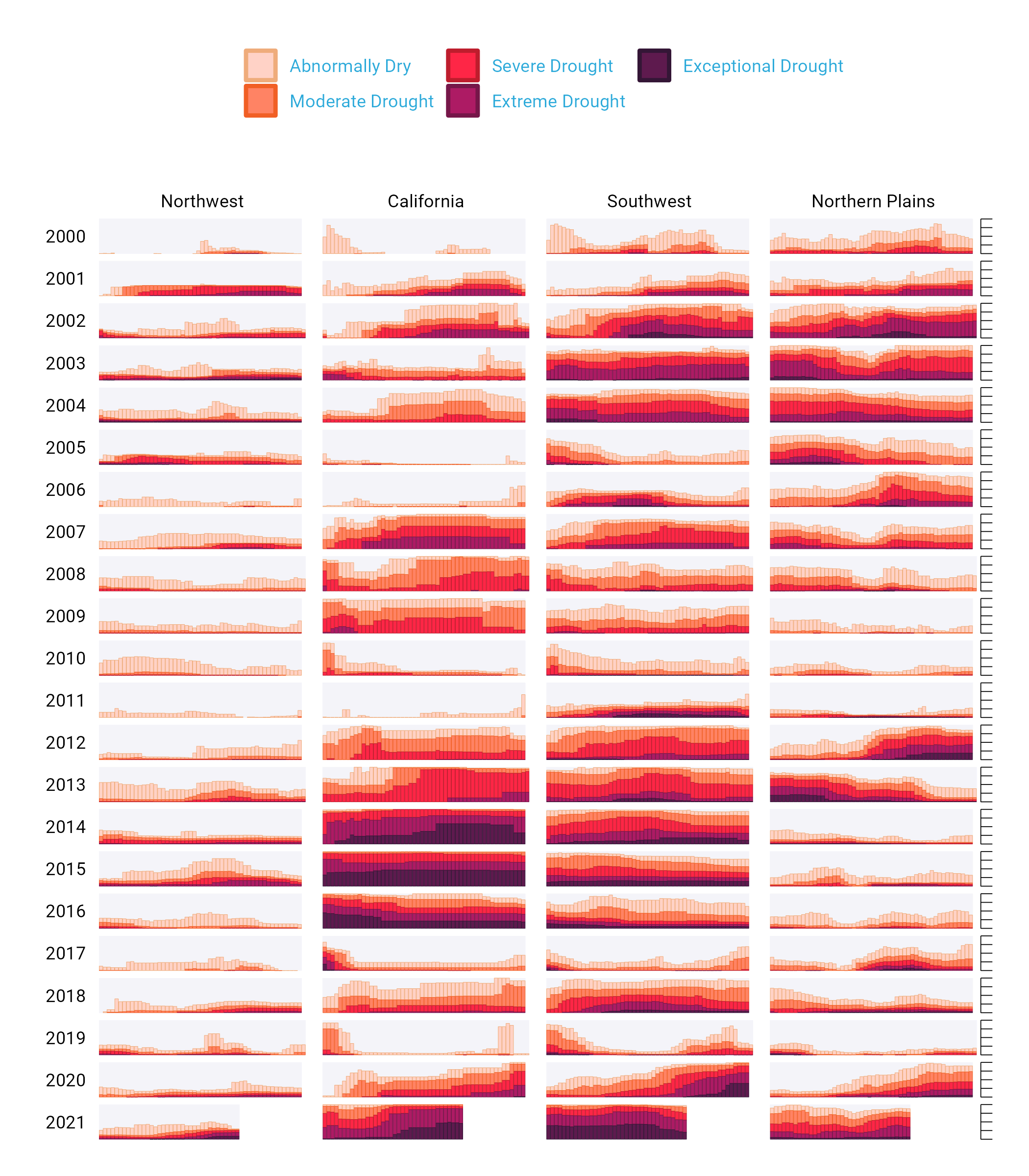
Figure 2-1 Test
To understand why this visualization is effective, let’s break it down into pieces.
At the broadest level, the data viz is also notable for its minimalist aesthetic. There are, for example, no grid lines, little text along the axes, and few text labels. What Cédric and Georgios have done is to remove what statistician Edward Tufte, in his 1983 book The Visual Display of Quantitative Information, calls “chartjunk.” Tufte wrote (and researchers as well as data viz designers since have generally agreed) that extraneous elements often hinder, rather than help, our understanding of charts.
Need proof that Cédric and Georgios’s decluttered graph is better than the alternative? Here’s a version with a few small tweaks to the code to include grid lines and text labels on axes. Prepare yourself for clutter!
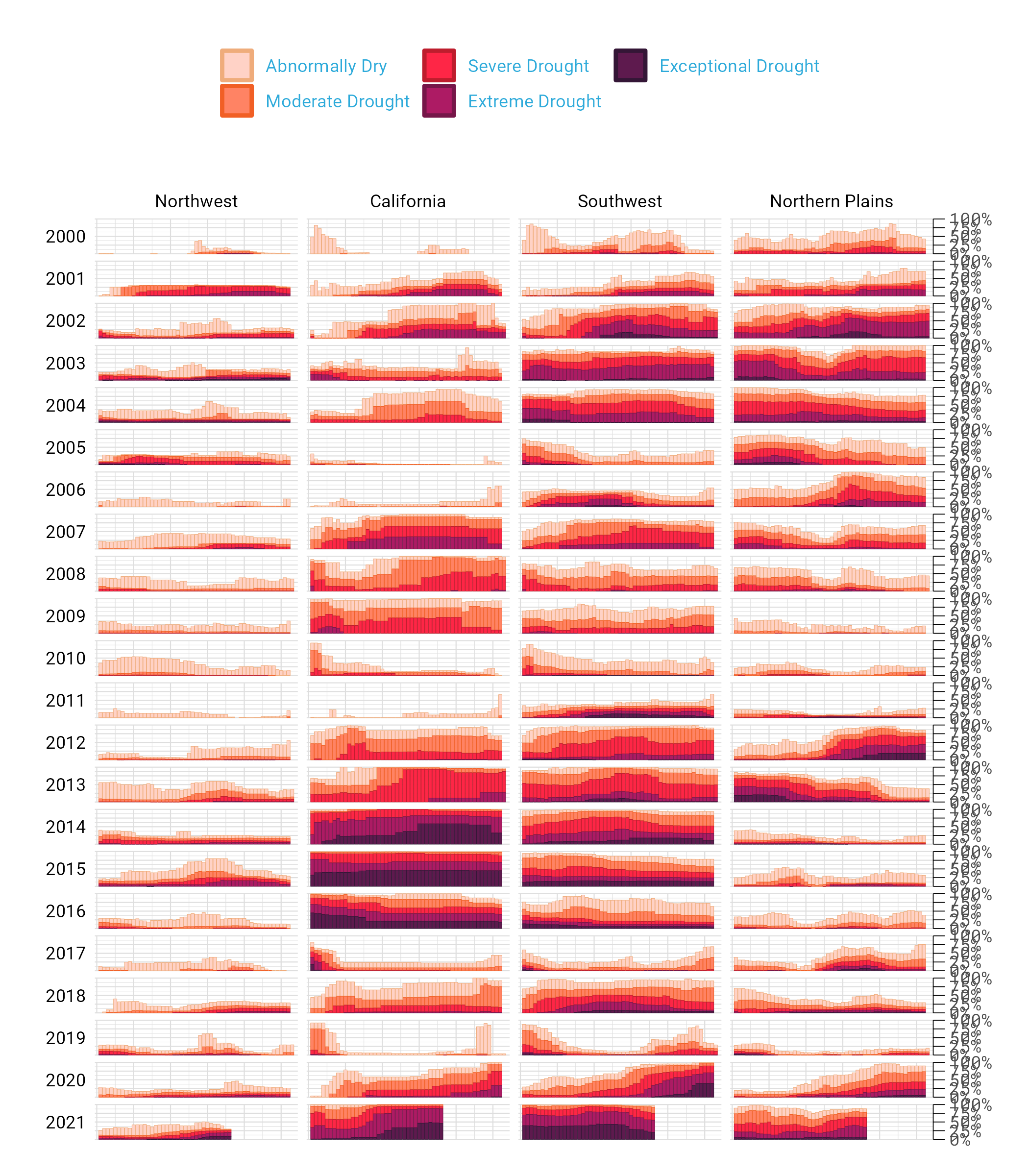
And, again, it’s not just that this cluttered version looks worse. The clutter actively inhibits understanding. Rather than focus on overall drought patterns (the point of the graph), our brain gets stuck reading repetitive and unnecessary axis text.
One of the best ways to reduce clutter is to break a single chart into what are known as small multiples. When we look closely at the data viz, we see that it is not one chart but actually a set of charts. Each rectangle represents one region in one year. If we filter to show the Southwest region in 2003 and add axis titles, we can see that the x axis shows the week while the y axis shows the percentage of that region at different drought levels.
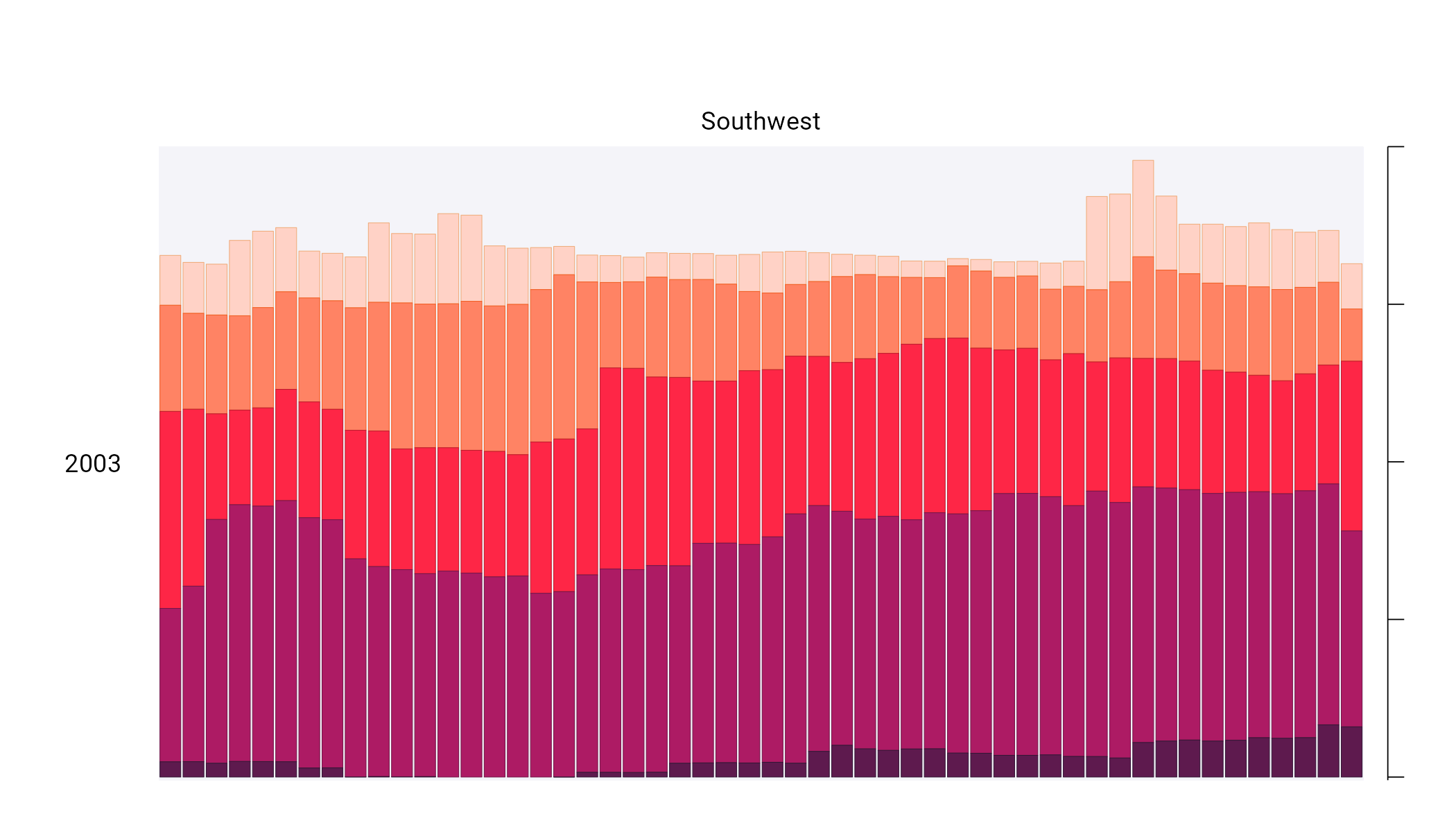
Zooming in on a single region in a single year also makes the color choices more obvious. The lightest bars show the percentage of the region that is abnormally dry while the darkest bars shows the percentage in exceptional drought conditions. These colors, as we’ll see shortly, are intentionally chosen to make differences in the drought levels visible to all readers.
When I asked Cédric and Georgios to speak with me about this data visualization, they initially told me that the code for this piece might be too simple to highlight the power of R for data viz. No, I told them, I want to speak with you precisely because the code is not super complex. The fact that Cédric and Georgios were able to produce this complex graph with relatively simple code shows the power of R for data visualization. And it is possible because of a theory called the grammar of graphics.
The Grammar of Graphics
If you’ve used Excel to make graphs, you’re probably familiar with this menu:
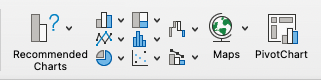
Working in Excel, your graph-making journey begins with the step of selecting the type of graph you want to make. Want a bar chart? Click the bar chart icon. Want a line chart? Click the line chart icon.
If you’ve only ever made data visualization in Excel, this first step may seem so obvious that you’ve never even considered conceptualizing the process of creating data visualization in any different way. This was certainly the case for me in my years as an Excel user.
But there are different ways to think about graphs. Rather than conceptualizing graphs types as being distinct, it is also possible to recognize the things that they have in common, and using these commonalities as the starting point for making graphs.
This approach to thinking about graphs comes from the late statistician Leland Wilkinson. Wilkinson thought deeply for years about what data visualization is and how we can describe it. In 1999, he published a book called The Grammar of Graphics that sought to develop a consistent way of describing all graphs.
Wilkinson argued that we should think of plots not as distinct types a la Excel, but as following a grammar that we can use to describe any plot. Throughout the book that Wilkinson is best remembered for, he presented general principles to describe graphs. Just as knowledge of English grammar tells us that a noun is typically followed by a verb (“he goes”) works while the opposite (“goes he”) does not, knowledge of the grammar of graphics allows us to understand why certain graph types “work.” Or, as Wilkinson put it,
A language consisting of words and no grammar (statement = word) expresses only as many ideas as there are words. … The grammar of graphics takes us beyond a limited set of charts (words) to an almost unlimited world of graphical forms (statements).
Thinking about data visualization through the lens of the grammar of graphics allow us to see, for example, that graphs typically have data that is plotted on the x axis and other data that is plotted on the y axis. And this is the case no matter whether the type of graph we end up with is, to take just two examples, a bar chart of a line chart. Consider these two graphs, which use data on life expectancy in Afghanistan:
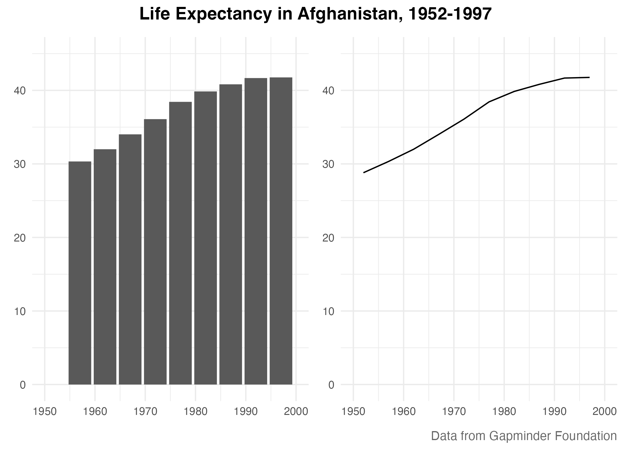
While they look different (and would, to the Excel user, be different types of graphs), Wilkinson’s grammar of graphics allows us to see their similarities.
As an academic statistician, Wilkinson’s goal in writing The Grammar of Graphics was to provide a novel way of thinking about data visualization. But his feelings on graph-making tools like Excel were clear when he wrote that “most charting packages channel user requests into a rigid array of chart types.”
At the time Wilkinson wrote his book, there was no data viz tool that could implement his grammar of graphics. This would change in 2010, when Hadley Wickham announced the ggplot2 package for R. Providing the tools to implement Wilkinson’s ideas, ggplot2 would come to revolutionize the world of data visualization.
ggplot2
Hadley Wickham’s article announcing ggplot2 (which I, like nearly everyone in the data viz world, will refer to simply as ggplot) was titled A Layered Grammar of Graphics. It showed a new R package that relied on the grammar of graphics and added on the idea of plots having multiple layers. Let’s walk through some of the most important layers.
When creating a graph with ggplot, we begin by mapping data to aesthetic properties. To the uninitiated, this may sound like complete nonsense. But all it means is that we use things like the x or y axis, color, size (aka aesthetic properties) to represent variables.
Let’s make this concrete using the same data on life expectancy in Afghanistan. Here’s what this data looks like.
#> # A tibble: 10 × 6
#>    country     continent  year lifeExp      pop gdpPercap
#>    <fct>       <fct>     <int>   <dbl>    <int>     <dbl>
#>  1 Afghanistan Asia       1952    28.8  8425333      779.
#>  2 Afghanistan Asia       1957    30.3  9240934      821.
#>  3 Afghanistan Asia       1962    32.0 10267083      853.
#>  4 Afghanistan Asia       1967    34.0 11537966      836.
#>  5 Afghanistan Asia       1972    36.1 13079460      740.
#>  6 Afghanistan Asia       1977    38.4 14880372      786.
#>  7 Afghanistan Asia       1982    39.9 12881816      978.
#>  8 Afghanistan Asia       1987    40.8 13867957      852.
#>  9 Afghanistan Asia       1992    41.7 16317921      649.
#> 10 Afghanistan Asia       1997    41.8 22227415      635.
If we want to make a chart with ggplot, we need to first decide which variable to use to put on the x axis and which to put on the y axis. Let’s say we want to show life expectancy over time. That means using the variable year on the x axis and the variable lifeExp on the y axis.
I begin by using the ggplot() function. Within this, I tell R that I’m using the data frame gapminder_10_rows (this is the filtered version I created from the full gapminder data frame, which includes over 1,700 rows of data). The line following this tells R to use year on the x and lifeExp on the y axis.
ggplot(
  data = gapminder_10_rows,
  mapping = aes(
    x = year,
    y = lifeExp
  )
)
When I run my code, what I get doesn’t look like much.
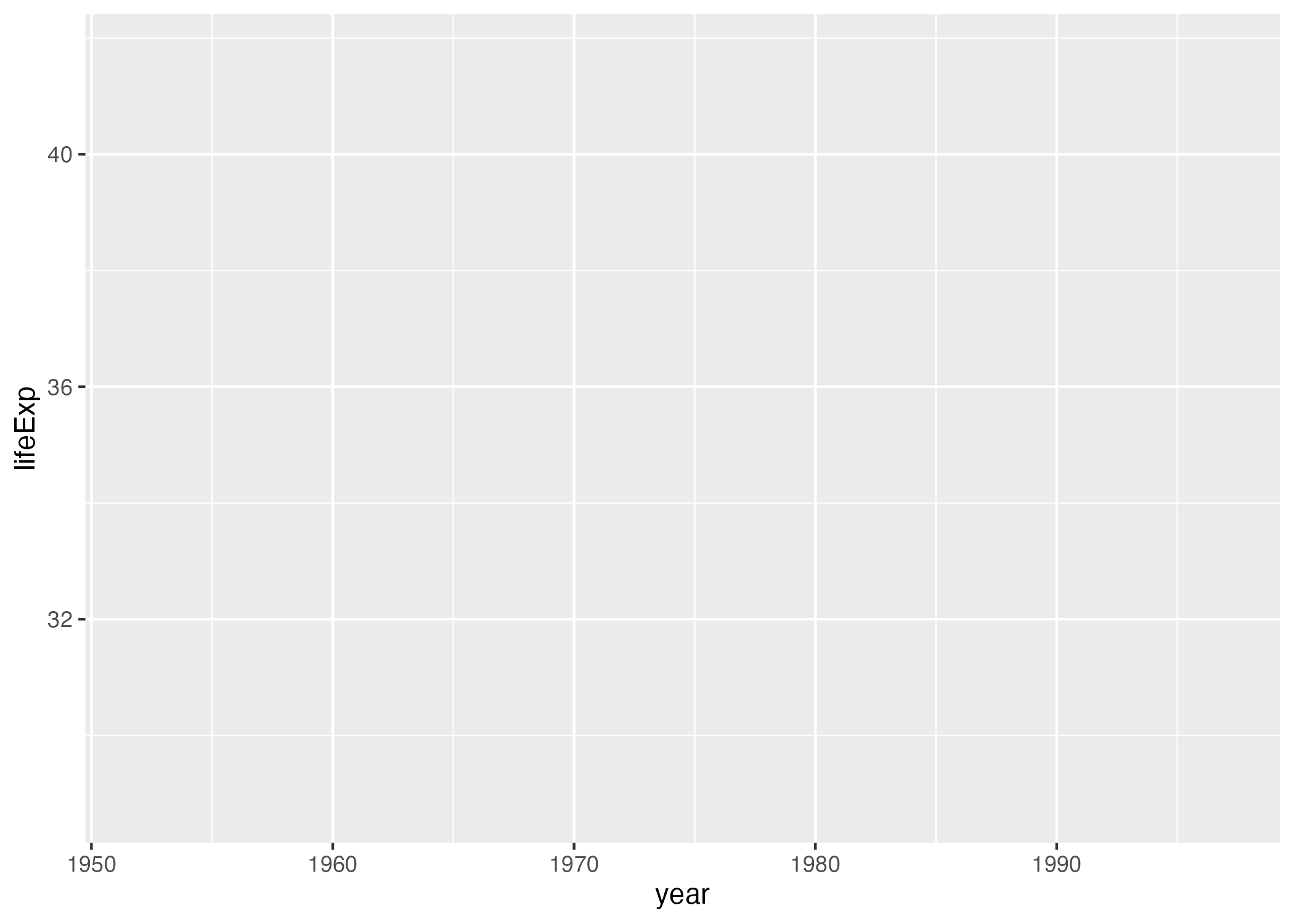
But if I look closely, I can see the beginnings of a plot. Remember that x axis using year? There it is! And lifeExp on the y axis? Yup, it’s there too.
I can also see that the values on the x and y axes match up to our data. In the gapminder_10_rows data frame, the first year is 1952 and the last year is 1997. The range of the x axis seems to have been created with this data in mind (spoiler: it was). And lifeExp, which goes from about 28 to about 42 will fit nicely on our y axis.
Axes are nice, but we’re missing any type of visual representation of the data. To get this, we need to add the next layer in ggplot: geoms. Short for geometric objects, geoms are different ways of representing data. For example, if we want to add points, we use geom_point().
ggplot(
  data = gapminder_10_rows,
  mapping = aes(
    x = year,
    y = lifeExp
  )
) +
  geom_point()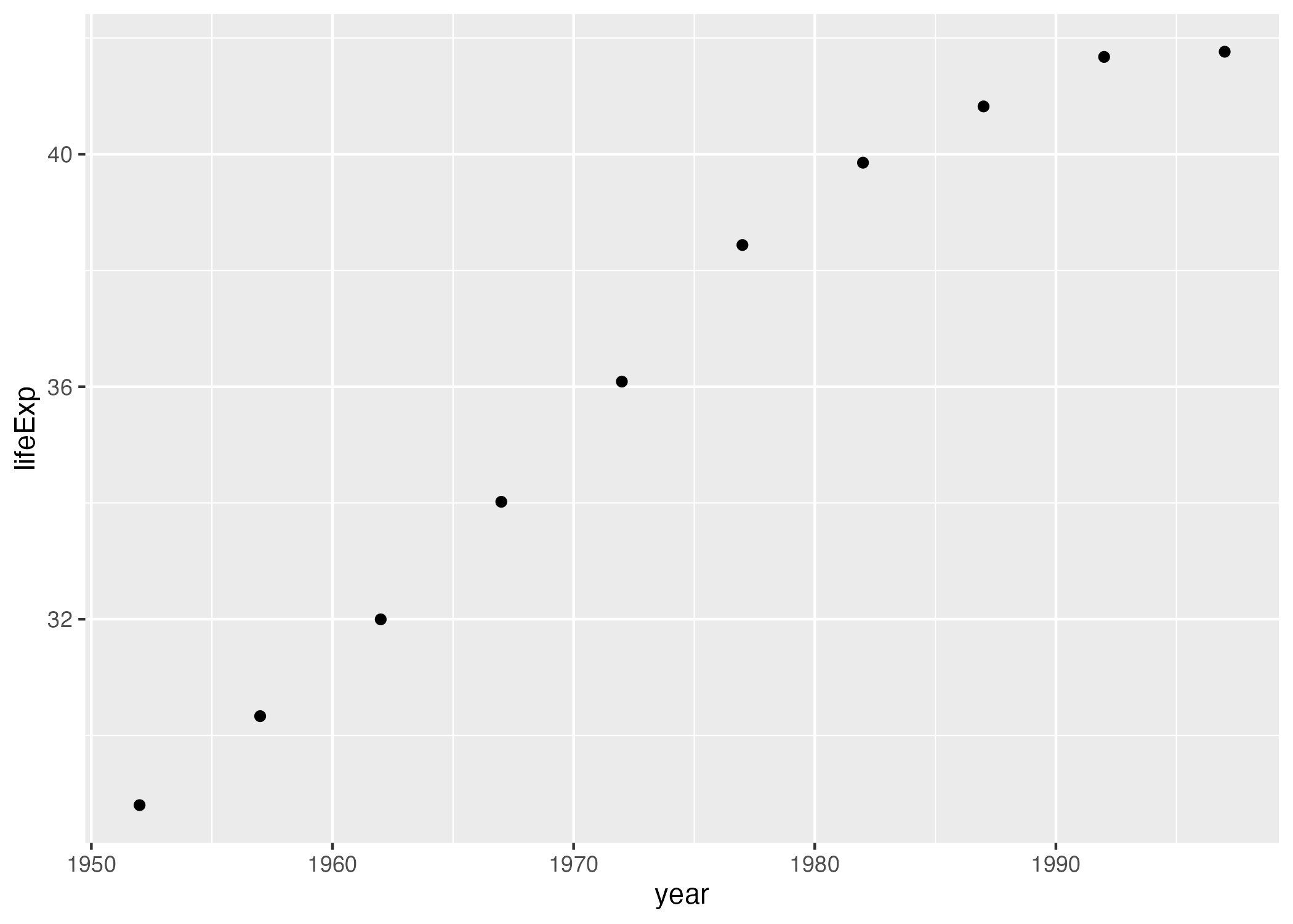
There we go! 1952 shows the life expectancy of about 28 and so on through every year in our data.
Let’s say we change our mind and want to make a line chart instead. Well, all we have to do is replace geom_point() with geom_line().
ggplot(
  data = gapminder_10_rows,
  mapping = aes(
    x = year,
    y = lifeExp
  )
) +
  geom_line()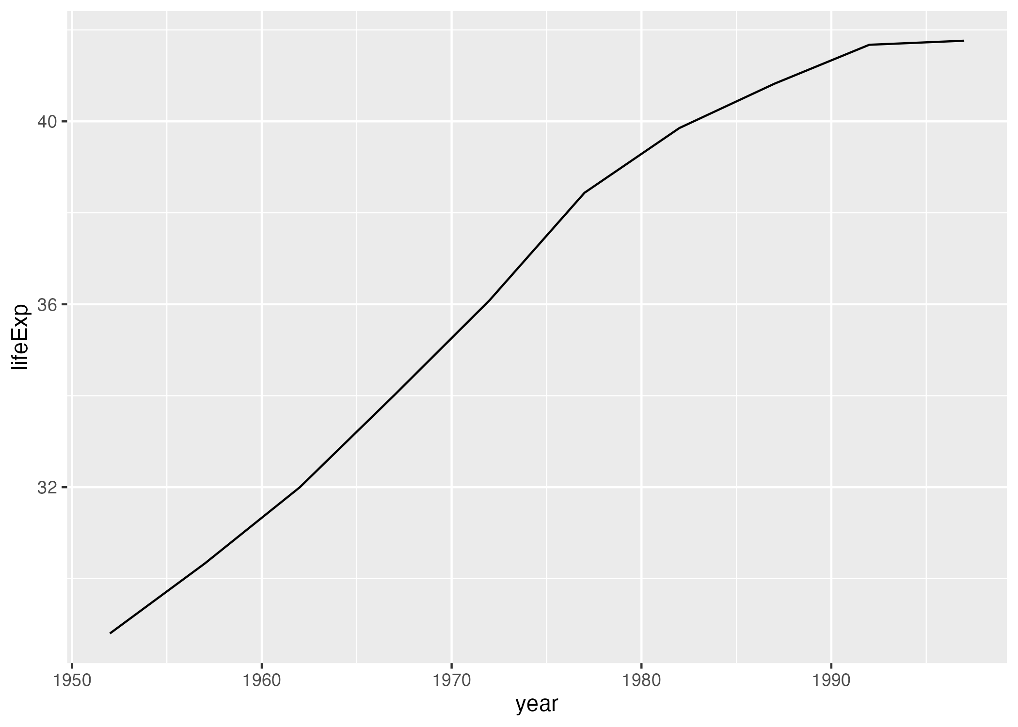
Or (and now we’re really getting fancy), what if we add both geom_point() and geom_line()? A line chart with points!
ggplot(
  data = gapminder_10_rows,
  mapping = aes(
    x = year,
    y = lifeExp
  )
) +
  geom_point() +
  geom_line()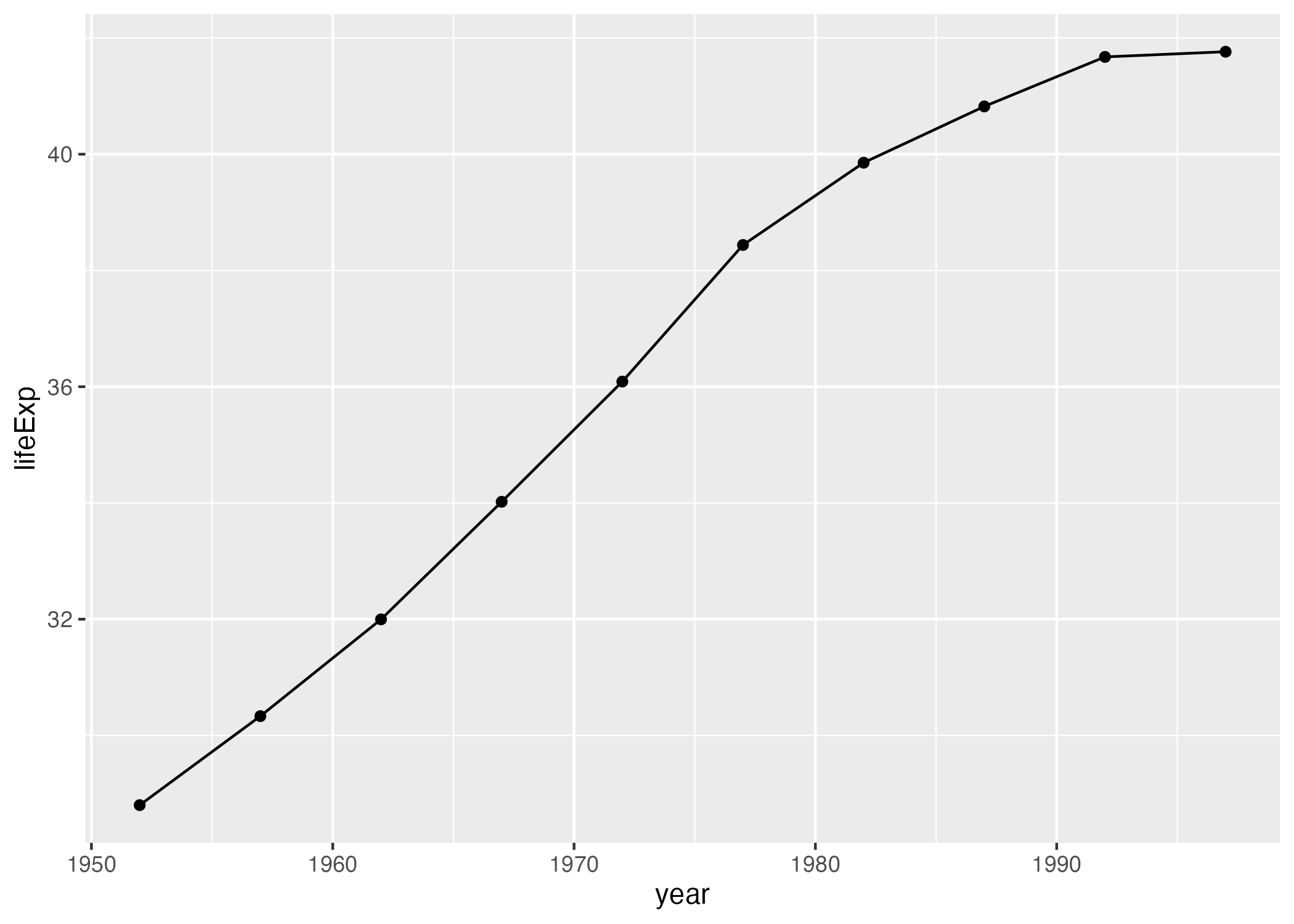
We can extend this idea further, swapping in geom_col() to create to a bar chart (note that the y axis range has been automatically updated now, going from 0 to 40 to account for the different geom).
ggplot(
  data = gapminder_10_rows,
  mapping = aes(
    x = year,
    y = lifeExp
  )
) +
  geom_col()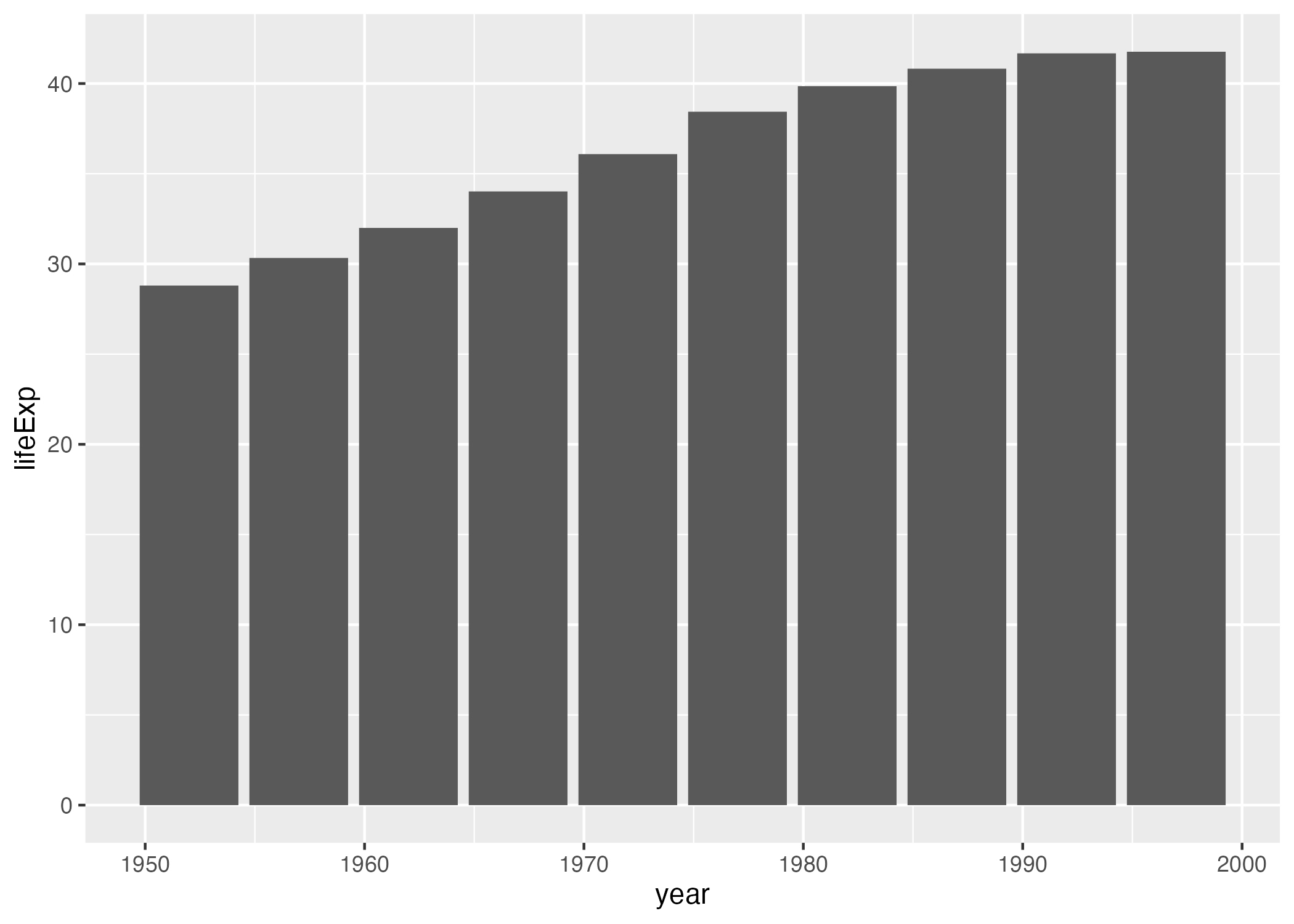
I hope you’re seeing how ggplot is a direct implementation of Wilkinson’s grammar of graphics. The difference between a line chart and a bar chart isn’t as great as the Excel chart type picker might have us think. Both can have the same aesthetic properties (namely, putting year on the x axis and life expectancy on the y axis), but simply use different geometric objects to visually represent the data.
Before we return to the drought data viz, let’s look at a few additional layers that can help us can alter our bar chart. Let’s say we want to change the color of our bars. In the grammar of graphics approach to chart-making, this means mapping some variable to the aesthetic property of fill (slightly confusingly, the aesthetic property “color” would, for a bar chart, change the outline of each bar). In the same way that we mapped year to the x axis and y to lifeExp, we can also map fill to a variable. Let’s try mapping fill to the year variable.
ggplot(
  data = gapminder_10_rows,
  mapping = aes(
    x = year,
    y = lifeExp,
    fill = year
  )
) +
  geom_col()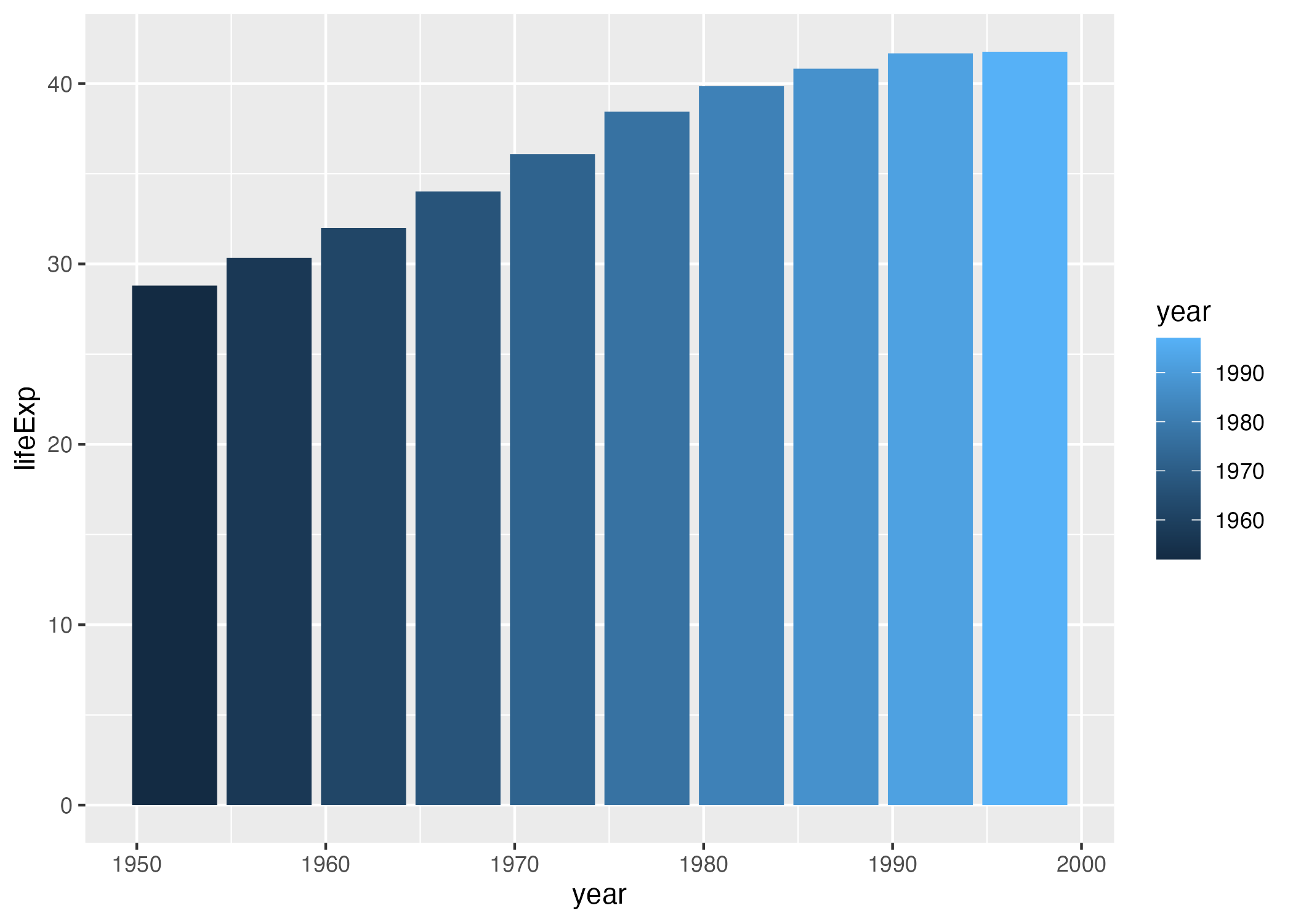
What we see now is that, for earlier years, the fill is darker while for later years, it is lighter (the legend, added to the right of our plot, shows this). What if we want to change the fill colors? For that, we use a new scale layer. In this case, I’ll use the scale_fill_viridis_c() function (the c at the end of the function name refers to the fact that the data is continuous). This function, just one of many functions that start with scale_ and can alter the fill scale, changes the default palette to one that is colorblind-friendly and prints well in grayscale.
ggplot(
  data = gapminder_10_rows,
  mapping = aes(
    x = year,
    y = lifeExp,
    fill = year
  )
) +
  geom_col() +
  scale_fill_viridis_c()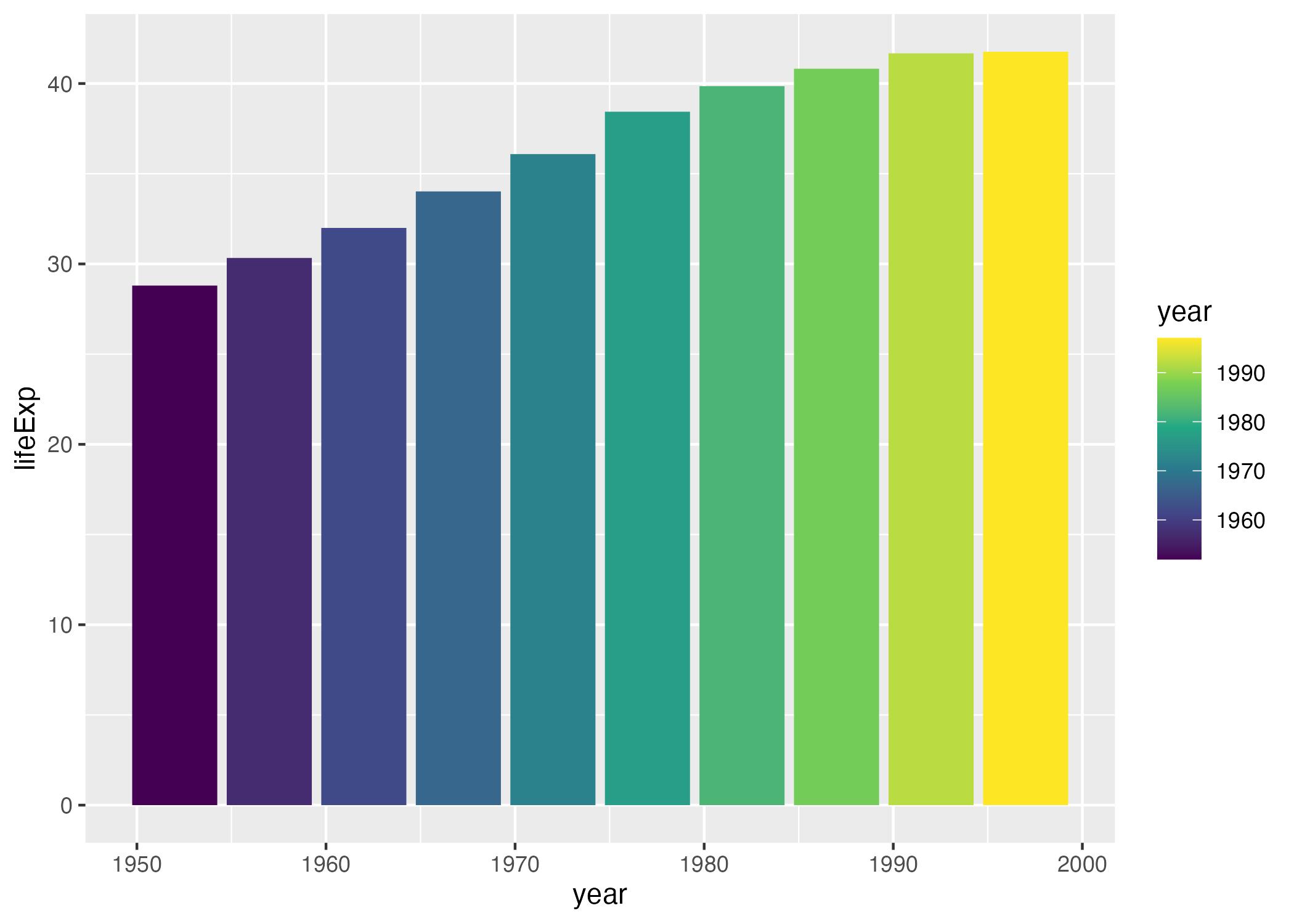
A final layer we’ll look at is the theme layer. This layer allows us to change the overall look-and-feel of plots (think: plot backgrounds, grid lines, etc). Just as there are a number of scale_ functions, there are also a number of functions that start with theme_. Below, I’ve added theme_minimal(), which starts to declutter our plot.
ggplot(
  data = gapminder_10_rows,
  mapping = aes(
    x = year,
    y = lifeExp,
    fill = year
  )
) +
  geom_col() +
  scale_fill_viridis_c() +
  theme_minimal()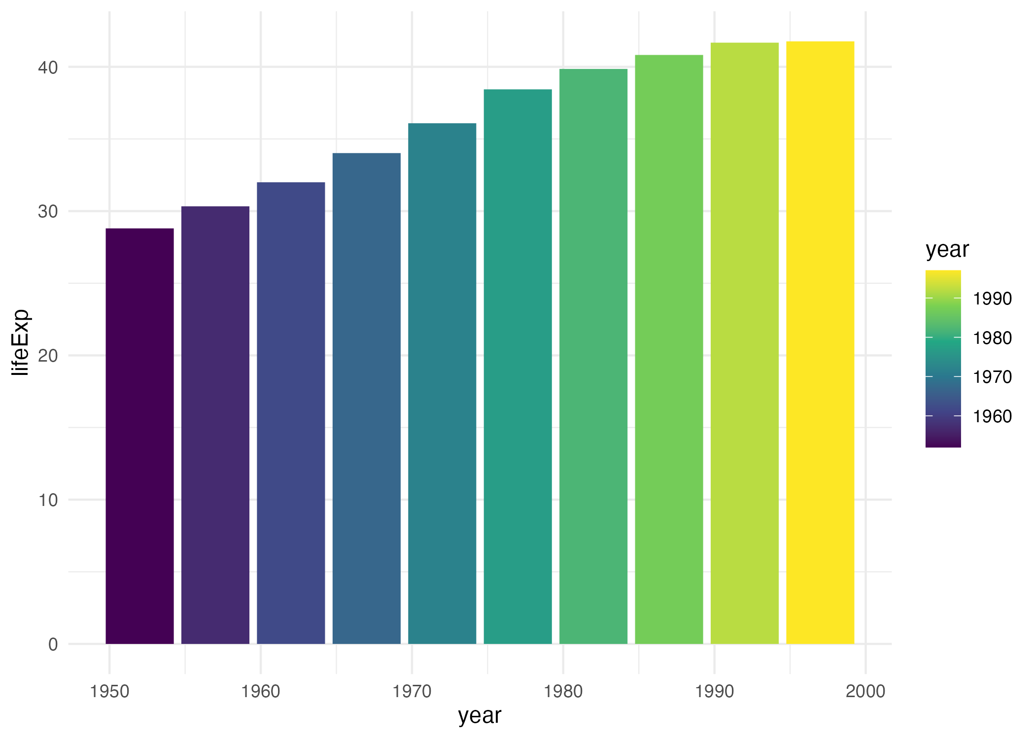
We’ve now seen why Hadley Wickham described the ggplot2 package as using a layered grammar of graphics. It relies on Leland Wilkinson’s theory and implements it through the creation of multiple layers:
- First, we select variables to map to aesthetic properties such as x or y axis, color/fill, etc
- Second, we choose the geometric object (aka geom) we want to use to represent our data
- Third, if we want to change aesthetic properties (for example, using a different palette), we do this with a
scale_function - Fourth, we use a
theme_function to set the overall look-and-feel of our plot.
There are many ways we could improve the plot we’ve been working on. But rather than improving an ugly plot, let’s instead return to the drought data viz that Cédric Scherer and Georgios Karamanis made. Going through their code will show us some familiar aspects of ggplot – and present some tips on how to make high-quality data visualization with R.
Recreating the Drought Visualization
The code that Cédric and Georgios wrote to make their final data viz relies on a combination of ggplot fundamentals and some less-well-known tweaks that make it really shine. In order to understand how Cédric and Georgios made their data viz, we’ll start out with a simplified version of their code. We’ll build it up layer by layer, adding elements until we can see exactly how they made their drought data viz.
Let’s start by looking again at one region (Southwest) in one year (2003). First, we filter our data and save it as a new object called southwest_2003.
We can take a look at this object to see the variables we have to work with:
- date: start date of the week of the observation
- hub: region
- category: level of drought (D0 = lowest level of drought; D5 = highest level)
- percentage: percentage of that region that is in that category of drought (0 = 0%, 1 = 100%)
- year: observation year
- week: week number (i.e. first week is week 1)
- max_week: the maximum number of weeks in a given year
southwest_2003 %>%
slice(1:10)
#> # A tibble: 10 × 7
#> date hub category perce…¹ year week max_w…²
#> <date> <fct> <fct> <dbl> <dbl> <dbl> <dbl>
#> 1 2003-12-30 Southwest D0 0.0718 2003 52 52
#> 2 2003-12-30 Southwest D1 0.0828 2003 52 52
#> 3 2003-12-30 Southwest D2 0.269 2003 52 52
#> 4 2003-12-30 Southwest D3 0.311 2003 52 52
#> 5 2003-12-30 Southwest D4 0.0796 2003 52 52
#> 6 2003-12-23 Southwest D0 0.0823 2003 51 52
#> 7 2003-12-23 Southwest D1 0.131 2003 51 52
#> 8 2003-12-23 Southwest D2 0.189 2003 51 52
#> 9 2003-12-23 Southwest D3 0.382 2003 51 52
#> 10 2003-12-23 Southwest D4 0.0828 2003 51 52
#> # … with abbreviated variable names ¹percentage, ²max_weekNow we can use this southwest_2003 object for our plotting. In the ggplot() function, we tell R to put week on the x axis, percentage on the y axis, and use the category variable (i.e. drought level) for our fill color. We then use geom_col() to create a bar chart where the fill color of each bar represents the percentage of the region in a single week that is at different drought levels. The colors don’t match the final version of the plot, but with this code we can start to see the outlines of Cédric and Georgios’s data viz.
ggplot(
  data = southwest_2003,
  aes(
    x = week,
    y = percentage,
    fill = category
  )
) +
  geom_col()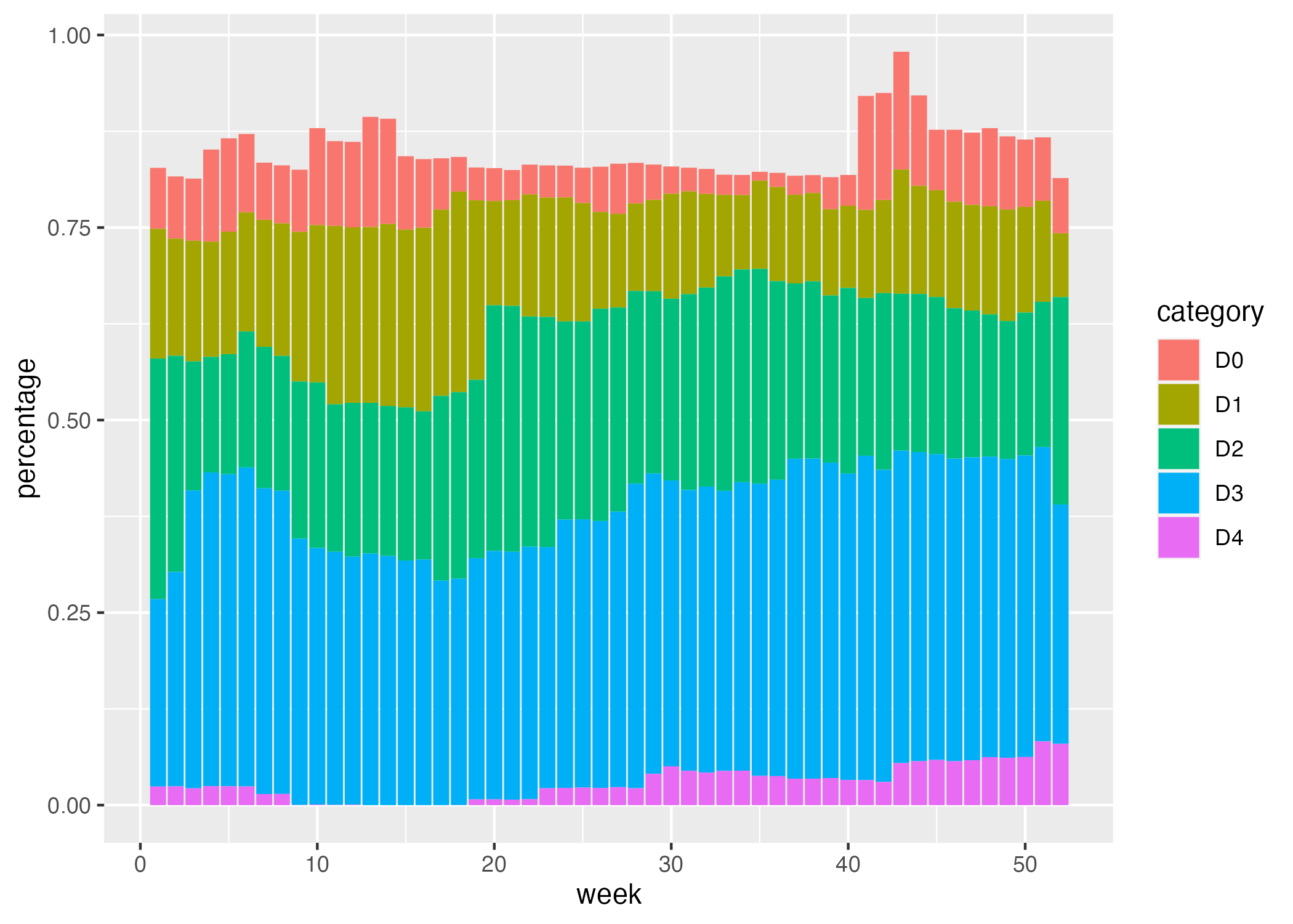
Cédric and Georgios next select different fill colors for their bars. They use the scale_fill_viridis_d() function. The “d” here means the data that the fill scale is being applied to has discrete categories (D0, D1, D2, D3, D4, D5). They use the argument option = "rocket" in order to select the “rocket” palette (the scale_fill_viridis_d() function has several other palettes). And they use the direction = -1 argument to reverse the order of fill colors so that darker colors mean higher drought conditions.
ggplot(
  data = southwest_2003,
  aes(
    x = week,
    y = percentage,
    fill = category
  )
) +
  geom_col() +
  scale_fill_viridis_d(
    option = "rocket",
    direction = -1
  )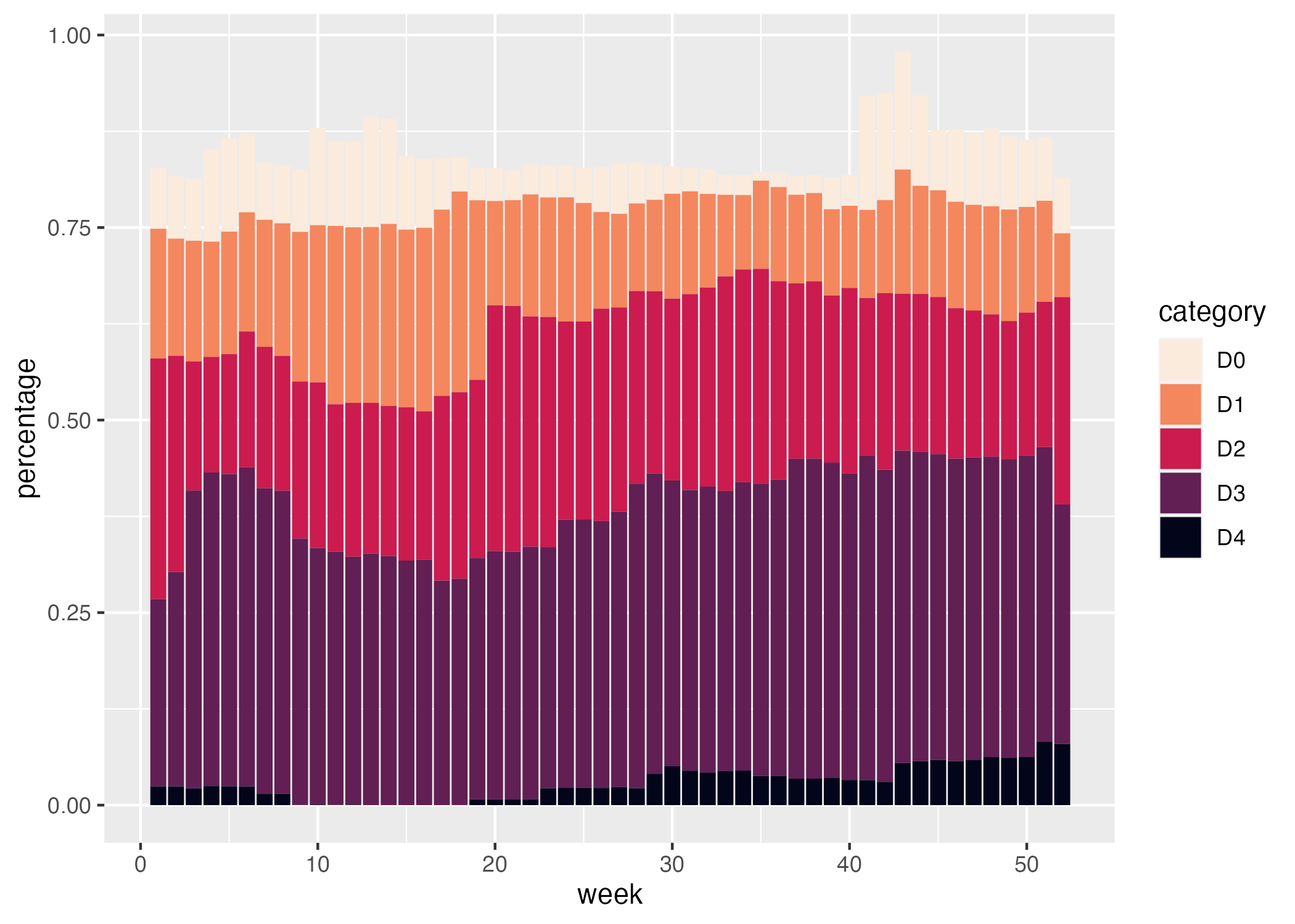
In the language of ggplot, x and y axis are aesthetic properties, the same as fill color. Cédric and Georgios tweak the x axis to remove both the axis title (“week”) using name = NULL and the 0-50 axis text with guide = none. On the y axis, they remove the axis title and axis text (which was showing percentages in 0.00, 0.25, 0.50, 0.75 format) using labels = NULL (this functionally does the same thing as guide = "none"). They also move the axis lines themselves to the right side using position = "right" (they are only apparent as tick marks at this point, but will become more visible later).
ggplot(
  data = southwest_2003,
  aes(
    x = week,
    y = percentage,
    fill = category
  )
) +
  geom_col() +
  scale_fill_viridis_d(
    option = "rocket",
    direction = -1
  ) +
  scale_x_continuous(name = NULL,
                     guide = "none") +
  scale_y_continuous(name = NULL,
                     labels = NULL,
                     position = "right")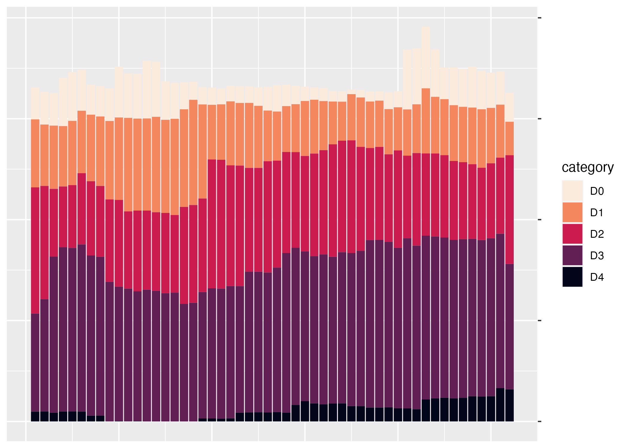
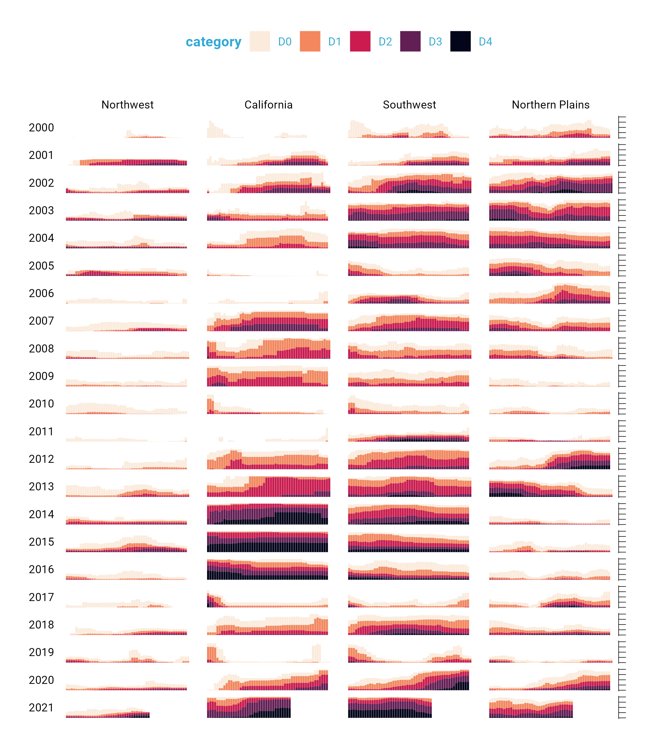
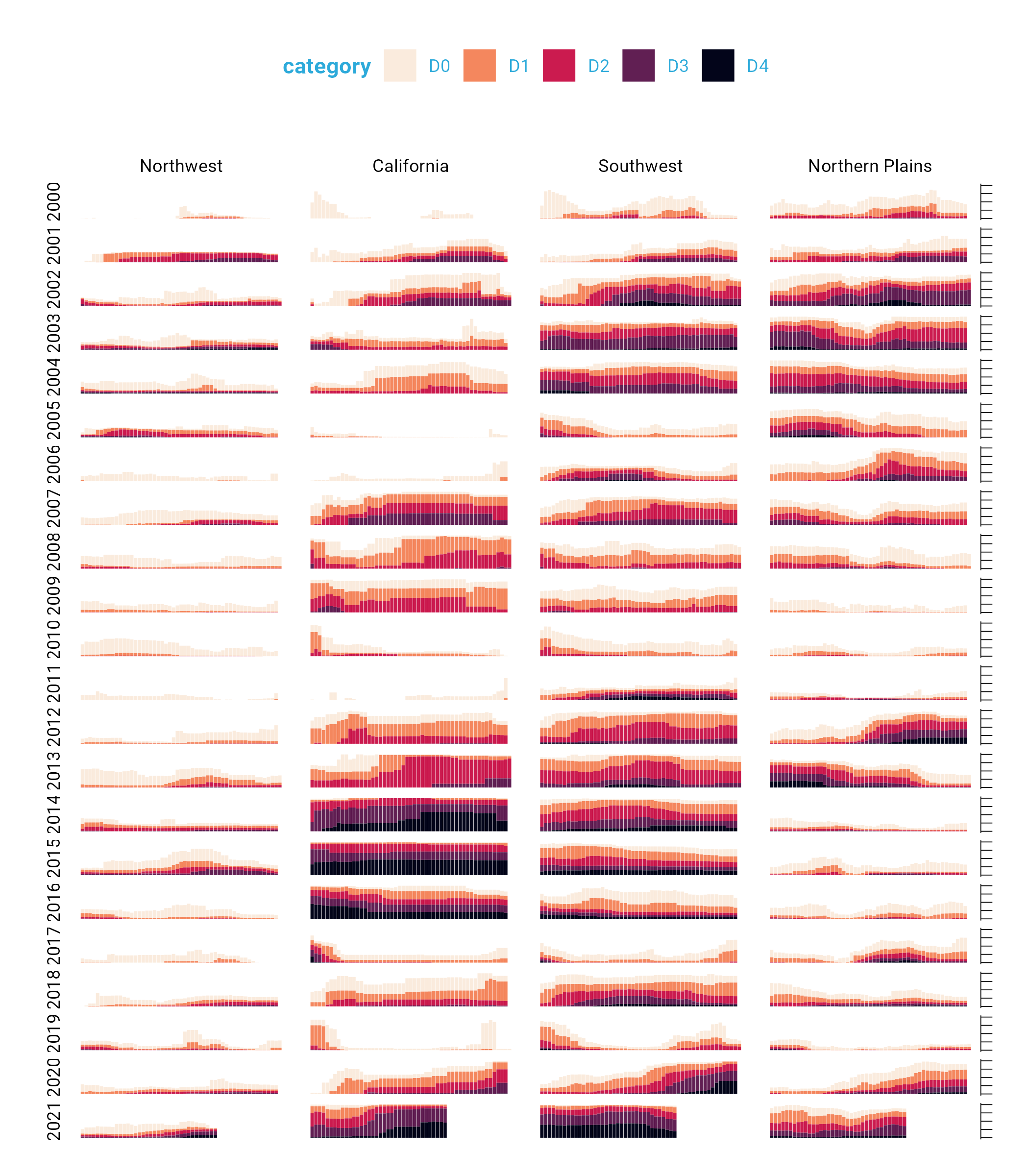
Up to this point, we’ve focused on one of the single plots that make up the larger data viz. But the final product that Cédric and Georgios made is actually 176 plots (22 years and 8 regions). One of the most useful features of ggplot is what’s known as facetting (known more commonly in the data viz world as small multiples). With the facet_grid() function, we can select which variable to put in rows and which to put in columns of our facetted plot. Cédric and Georgios put year in rows and hub (region) in columns. The switch = "y" argument moves the year label from the right side (where it appears by default) to the left. With this code in place, we can see the final plot coming together. Space considerations require me to again include only four regions, but you get the idea.
dm_perc_cat_hubs %>%
  filter(hub %in% c("Northwest",
                    "California",
                    "Southwest",
                    "Northern Plains")) %>%
  ggplot(aes(x = week,
             y = percentage,
             fill = category)) +
  geom_col() +
  scale_fill_viridis_d(
    option = "rocket",
    direction = -1
  ) +
  scale_x_continuous(name = NULL,
                     guide = "none") +
  scale_y_continuous(name = NULL,
                     labels = NULL,
                     position = "right") +
  facet_grid(rows = vars(year),
             cols = vars(hub),
             switch = "y")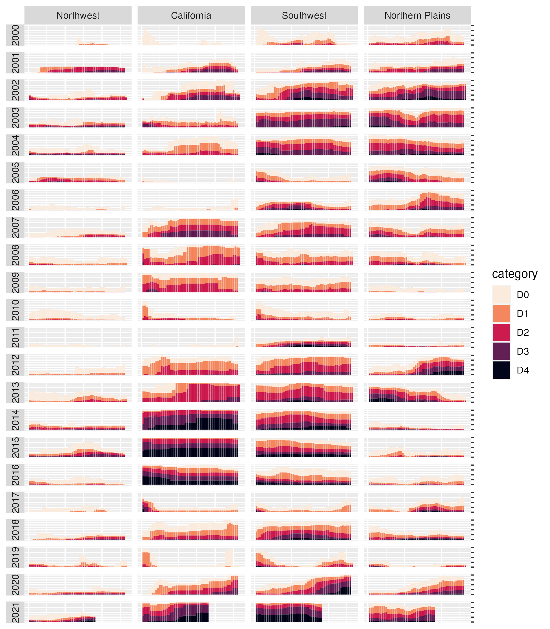
Incredibly, the broad outlines of the plot took us just 10 lines to create. All of the final code from here on out falls in the category of small polishes. That’s not to minimize how important small polishes are (very) or the time it takes to create them (lots). But it is to say that a little bit of ggplot goes a long way.
Let’s look at a few of the small polishes that Cédric and Georgios make. The first is to apply a theme. They use theme_light(), which removes the default gray background and changes the font to Roboto.
dm_perc_cat_hubs %>%
  filter(hub %in% c("Northwest",
                    "California",
                    "Southwest",
                    "Northern Plains")) %>%
  ggplot(aes(x = week,
             y = percentage,
             fill = category)) +
  geom_col() +
  scale_fill_viridis_d(
    option = "rocket",
    direction = -1
  ) +
  scale_x_continuous(name = NULL,
                     guide = "none") +
  scale_y_continuous(name = NULL,
                     labels = NULL,
                     position = "right") +
  facet_grid(rows = vars(year),
             cols = vars(hub),
             switch = "y") +
  theme_light(base_family = "Roboto")
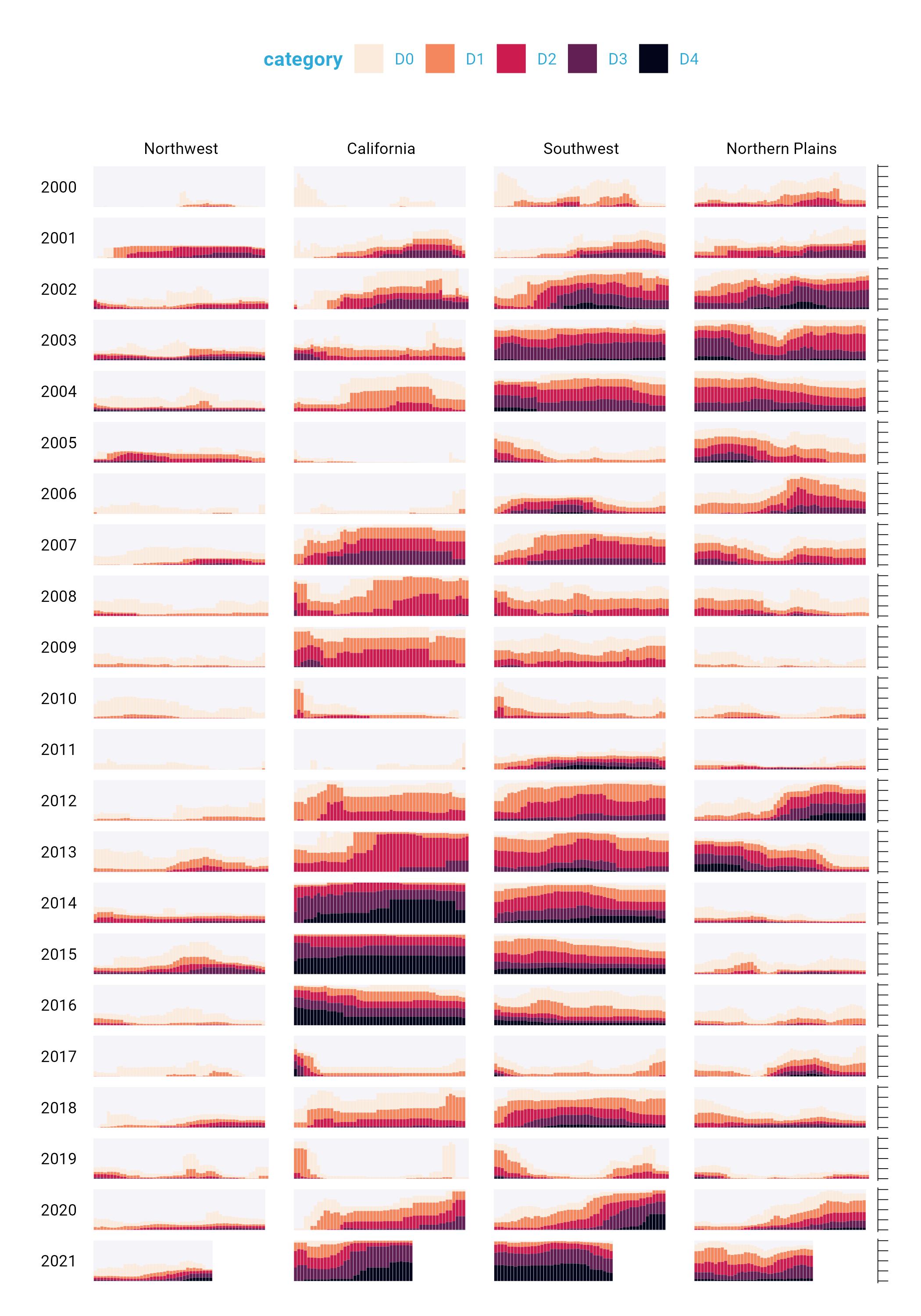
theme_light() is what’s known as a “complete theme.” So-called complete themes change the overall look-and-feel of a plot. But Cédric and Georgios don’t stop with applying a complete theme. From there, they use the theme() function to make additional tweaks to what theme_light() gives them.
dm_perc_cat_hubs %>%
  filter(hub %in% c("Northwest",
                    "California",
                    "Southwest",
                    "Northern Plains")) %>%
  ggplot(aes(x = week,
             y = percentage,
             fill = category)) +
  geom_col() +
  scale_fill_viridis_d(
    option = "rocket",
    direction = -1
  ) +
  scale_x_continuous(name = NULL,
                     guide = "none") +
  scale_y_continuous(name = NULL,
                     labels = NULL,
                     position = "right") +
  facet_grid(rows = vars(year),
             cols = vars(hub),
             switch = "y") +
  theme_light(base_family = "Roboto") +
  theme(
    axis.title = element_text(size = 14,
                              color = "black"),
    axis.text = element_text(family = "Roboto Mono",
                             size = 11),
    axis.line.x = element_blank(),
    axis.line.y = element_line(color = "black",
                               size = .2),
    axis.ticks.y = element_line(color = "black",
                                size = .2),
    axis.ticks.length.y = unit(2, "mm"),
    legend.position = "top",
    legend.title = element_text(color = "#2DAADA",
                                face = "bold"),
    legend.text = element_text(color = "#2DAADA"),
    strip.text.x = element_text(hjust = .5,
                                face = "plain",
                                color = "black",
                                margin = margin(t = 20, b = 5)),
    strip.text.y.left = element_text(angle = 0,
                                     vjust = .5,
                                     face = "plain",
                                     color = "black"),
    strip.background = element_rect(fill = "transparent",
                                    color = "transparent"),
    panel.grid.minor = element_blank(),
    panel.grid.major = element_blank(),
    panel.spacing.x = unit(0.3, "lines"),
    panel.spacing.y = unit(0.25, "lines"),
    panel.background = element_rect(fill = "transparent",
                                    color = "transparent"),
    panel.border = element_rect(color = "transparent",
                                size = 0),
    plot.background = element_rect(fill = "transparent",
                                   color = "transparent",
                                   size = .4),
    plot.margin = margin(rep(18, 4))
  )
The code in the theme() function does many different things, but let’s take a look at a few of the most important:
legend.position = "top" moves the legend from the right (the default) to the top of the plot.
strip.text.y.left = element_text(size = 18, angle = 0, vjust = .5, face = "plain", color = "black") turns the year text in the columns so that it is no longer angled. Without the angle = 0, the years would be much less readable.
The following lines make the distinctive axis lines and ticks that show up on the right side of the final plot:
axis.line.x = element_blank(),
axis.line.y = element_line(color = "black", size = .2),
axis.ticks.y = element_line(color = "black", size = .2),
axis.ticks.length.y = unit(2, "mm")
panel.grid.minor = element_blank() and panel.grid.major = element_blank() remove all grid lines from the final plot.
And finally, these three lines remove the borders and make each of the individual plots have a transparent background.
panel.background = element_rect(fill = "transparent", color = "transparent"),
panel.border = element_rect(color = "transparent", size = 0),
plot.background = element_rect(fill = "transparent", color = "transparent", size = .4)
Keen readers such as yourself may now be thinking: “wait, didn’t the individual plots have a gray background behind them?” Yes, dear reader, they did. How did Cédric and Georgios make these? They did this with a separate geom: geom_rect(). Here, they set some additional aesthetic properties specific to geom_rect() (xmin, xmax, ymin, and ymax). The result is a gray background drawn behind each small multiple.
geom_rect(
  aes(
    xmin = .5,
    xmax = max_week + .5,
    ymin = -0.005,
    ymax = 1
  ),
  fill = "#f4f4f9",
  color = NA,
  size = 0.4
)
The final polish to highlight is the tweaks to the legend. I previously showed a simplified version of the scale_fill_viridis_d() function. A more complete version is as follows. The name argument sets the legend title and the labels argument determine the labels that show up in the legend. Rather than D0, D1, D2, D3, and D4, we now have Abnormally Dry, Moderate Drought, Severe Drought, Extreme Drought, and Exceptional Drought.
scale_fill_viridis_d(
  option = "rocket",
  direction = -1,
  name = "Category:",
  labels = c(
    "Abnormally Dry",
    "Moderate Drought",
    "Severe Drought",
    "Extreme Drought",
    "Exceptional Drought"
  )
)
While I’ve showed you a nearly complete version of the code, I have made some small changes along the way to make it easier to understand. If you’re curious to see the full code Cédric and Georgios used to create the data viz, here it is. There are a few additional tweaks to colors and spacing, but nothing major beyond what we’ve seen so far.
ggplot(dm_perc_cat_hubs, aes(week, percentage)) +
  geom_rect(
    aes(
      xmin = .5,
      xmax = max_week + .5,
      ymin = -0.005,
      ymax = 1
    ),
    fill = "#f4f4f9",
    color = NA,
    size = 0.4,
    show.legend = FALSE
  ) +
  geom_col(
    aes(
      fill = category,
      fill = after_scale(addmix(darken(fill, .05,
                                       space = "HLS"),
                                "#d8005a",
                                .15)),
      color = after_scale(darken(fill, .2,
                                 space = "HLS"))
    ),
    width = .9,
    size = 0.12
  ) +
  facet_grid(rows = vars(year),
             cols = vars(hub),
             switch = "y") +
  coord_cartesian(clip = "off") +
  scale_x_continuous(expand = c(.02, .02),
                     guide = "none",
                     name = NULL) +
  scale_y_continuous(expand = c(0, 0),
                     position = "right",
                     labels = NULL,
                     name = NULL) +
  scale_fill_viridis_d(
    option = "rocket",
    name = "Category:",
    direction = -1,
    begin = .17,
    end = .97,
    labels = c(
      "Abnormally Dry",
      "Moderate Drought",
      "Severe Drought",
      "Extreme Drought",
      "Exceptional Drought"
    )
  ) +
  guides(fill = guide_legend(nrow = 2,
                             override.aes = list(size = 1))) +
  theme_light(base_size = 18,
              base_family = "Roboto") +
  theme(
    axis.title = element_text(size = 14,
                              color = "black"),
    axis.text = element_text(family = "Roboto Mono",
                             size = 11),
    axis.line.x = element_blank(),
    axis.line.y = element_line(color = "black",
                               size = .2),
    axis.ticks.y = element_line(color = "black",
                                size = .2),
    axis.ticks.length.y = unit(2, "mm"),
    legend.position = "top",
    legend.title = element_text(color = "#2DAADA",
                                size = 18,
                                face = "bold"),
    legend.text = element_text(color = "#2DAADA",
                               size = 16),
    strip.text.x = element_text(size = 16,
                                hjust = .5,
                                face = "plain",
                                color = "black",
                                margin = margin(t = 20, b = 5)),
    strip.text.y.left = element_text(size = 18,
                                     angle = 0,
                                     vjust = .5,
                                     face = "plain",
                                     color = "black"),
    strip.background = element_rect(fill = "transparent",
                                    color = "transparent"),
    panel.grid.minor = element_blank(),
    panel.grid.major = element_blank(),
    panel.spacing.x = unit(0.3, "lines"),
    panel.spacing.y = unit(0.25, "lines"),
    panel.background = element_rect(fill = "transparent",
                                    color = "transparent"),
    panel.border = element_rect(color = "transparent",
                                size = 0),
    plot.background = element_rect(fill = "transparent",
                                   color = "transparent",
                                   size = .4),
    plot.margin = margin(rep(18, 4))
  )
ggplot is Your Data Viz Secret Weapon
If you take up ggplot, you may start to think of it as a solution to all of your data viz problems. Yes, you have a new hammer, but no, everything is not a nail. If you look at the version of this data viz that appeared in Scientific American1, you’ll see that there are some annotations not visible in our recreation. That’s because they were added in post-production outside of ggplot. While you can come up with ways to do everything in ggplot, it’s often not the best use of your time. Get yourself 90% of the way there with ggplot and then use Illustrator, Figma, or a similar tool to finish off your work.
With that caveat in place, ggplot is a very powerful hammer. And it’s a hammer used to make plots that you’ve seen in the New York Times, FiveThirtyEight, the BBC, and other well-known news outlets. ggplot is so popular not because it is the only tool that can make data viz that follows principles of high-quality data viz, but because it makes it straightforward to do so. The graph that Cédric Scherer and Georgios Karamanis made shows this in several ways:
-
It strips away extraneous elements such as grid lines in order to keep the focus on the data itself. Complete themes such as
theme_light()and thetheme()function allowed Cédric and Georgios to create a decluttered visualization that communicates effectively. -
It uses well-chosen colors. The
scale_fill_viridis_d()allowed them to create a color scheme that shows differences between groups well, is both colorblind-friendly, and shows up well when printed in grayscale. -
It uses small multiples to break data from two decades and eight regions into a set of graphs that come together to create a single plot. With a single call to the
facet_grid()function, Cédric and Georgios created over 100 small multiples that are automatically combined into a single plot.
Learning to create data visualization in ggplot involves a significant time investment. But the long-term payoff is even greater. Once you learn how ggplot works, you can look at others’ code and learn how to improve your own. Take Cédric and Georgios’s code, run it on your own system, and the beautiful visualization they made will magically appear.
Being able to run and learn from others’ code is not something you can do in Excel. When you make a data viz in Excel, the series of point-and-click steps disappear into the ether with each use. Want to recreate a visualization you made last week? You’ll need to remember the exact steps you used. Want to make a data viz that you saw someone else make? You’ll need them to write up their process for you.
Code-based data viz tools like ggplot allow you to keep that record of the steps you made. In the end, that’s all code is: a set of instructions. And it’s a set of instructions that you can re-run or you can share with others for them to run. Or the reverse: others can share their code and you can learn from them. You don’t have to be the most talented designer to make high-quality data viz with ggplot. You can study others’ code, adapt it to your own needs, and create your own data viz with ggplot that is beautiful and communicates effectively.