---
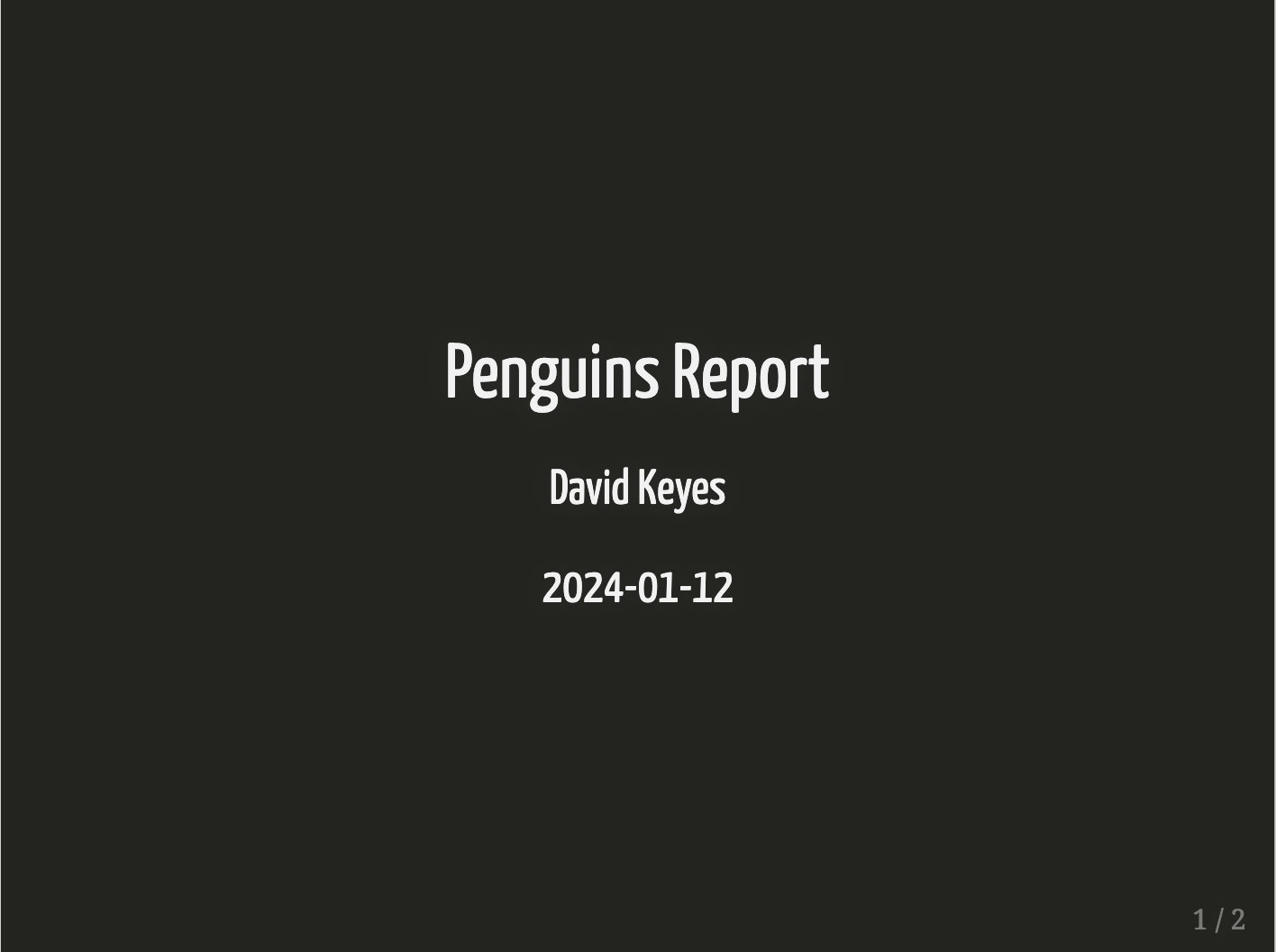
title: "Penguins Report"
author: "David Keyes"
date: "2024-01-12"
output: xaringan::moon_reader
---8 Slideshow Presentations
You are reading the free online version of this book. If you’d like to purchase a physical or electronic copy, you can buy it from No Starch Press, Powell’s, Barnes and Noble or Amazon.
If you need to create a slideshow presentation, like one you might create in PowerPoint, R has you covered. In this chapter, you’ll learn how to produce presentations using xaringan. This package, which uses R Markdown, is the most widely used tool for creating slideshows in R.
You’ll use xaringan to turn the penguin report from Chapter 6 into a slideshow. You’ll learn how to create new slides, selectively reveal content, adjust text and image alignment, and style your presentation with CSS.
Why Use xaringan?
You might have noticed the Presentation option while creating a new R Markdown document in RStudio. This option offers several ways to make slides, such as knitting an R Markdown document to PowerPoint. However, using the xaringan package provides advantages over these options.
For example, because xaringan creates slides as HTML documents, you can post them online versus having to email them or print them out for viewers. You can send someone the presentation simply by sharing a link. Chapter 9 will discuss ways to publish your presentations online.
A second benefit of using xaringan is accessibility. HTML documents are easy to manipulate, giving viewers control over their appearance. For example, people with limited vision can access HTML documents in ways that allow them to view the content, such as by increasing the text size or using screen readers. Making presentations with xaringan lets more people engage with your slides.
How xaringan Works
To get started with xaringan, run install.packages("xaringan") in RStudio to install the package. Next, navigate to File > New File > R Markdown to create a new project. Choose the From Template tab and select the template called Ninja Presentation, then click OK.
You should get an R Markdown document containing some default content. Delete this and add the penguin R report you created in Chapter 6. Then, change the output format in the YAML to xaringan::moon_reader like so:
The moon_reader output format takes R Markdown documents and knits them as slides. Try clicking Knit to see what this looks like. You should get an HTML file with the same name as the R Markdown document (such as xaringan-example.html), as shown in Figure 8.1.
If you scroll to the next slide with the right arrow key, you should see familiar content. Figure 8.2 shows the second slide, which has the same text as the report from Chapter 6 and a cut-off version of its histogram.
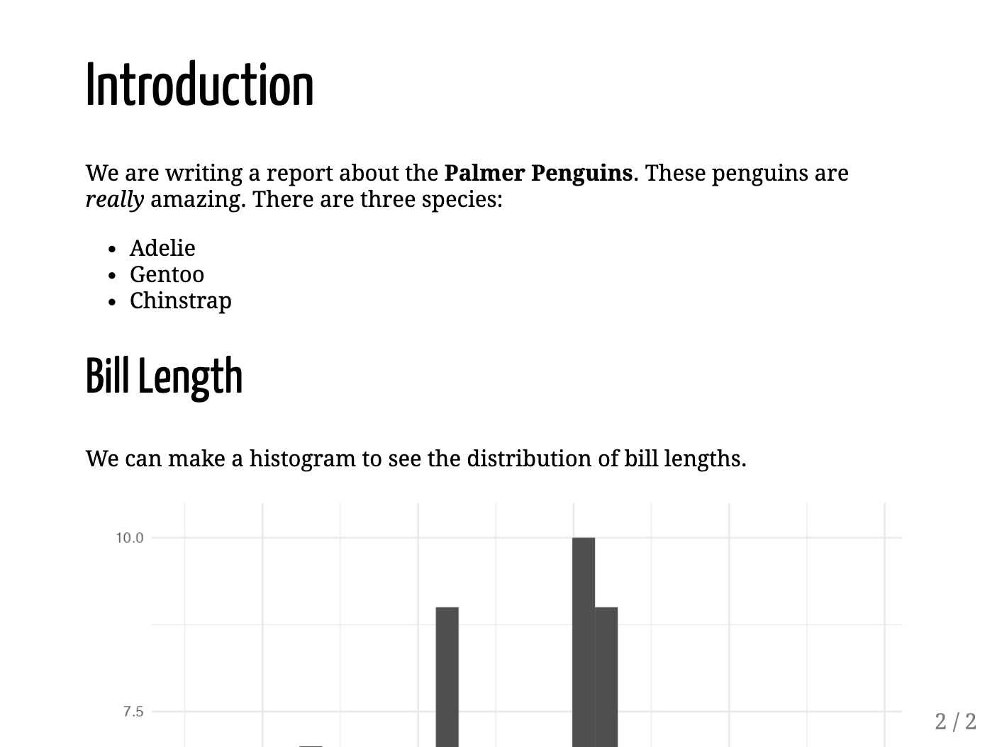
Although the syntax for making slides with xaringan is nearly identical to that used to make reports with R Markdown, you need to make a few tweaks so that the content can fit on the slides. When you’re working in a document that will be knitted to Word, its length doesn’t matter, because reports can have 1 page or 100 pages. Working with xaringan, however, requires you to consider how much content can fit on a single slide. The cut-off histogram demonstrates what happens if you don’t. You’ll fix it next.
Creating a New Slide
You’ll make this histogram fully visible by putting it in its own slide. To make a new slide, add three dashes (---) where you’d like it to begin. I’ve added them before the histogram code:
---

## Bill Length

We can make a histogram to see the distribution of bill lengths.

```{r}
penguins %>%
  ggplot(aes(x = bill_length_mm)) +
  geom_histogram() +
  theme_minimal()
```
When you knit the document again, what was one slide should now be broken into two: an Introduction slide and a Bill Length slide. However, if you look closely, you’ll notice that the bottom of the histogram is still slightly cut off. To correct this, you’ll change its size.
Adjusting the Size of Figures
Adjust the size of the histogram using the code chunk option fig.height:
---

## Bill Length

We can make a histogram to see the distribution of bill lengths.

```{r fig.height = 4}
penguins %>%
  ggplot(aes(x = bill_length_mm)) +
  geom_histogram() +
  theme_minimal()
```
Doing this fits the histogram fully on the slide and also reveals the text that was hidden below it. Keep in mind that fig.height adjusts only the figure’s output height; sometimes you may need to adjust the output width using fig.width in addition or instead.
Revealing Content Incrementally
When presenting a slideshow, you might want to show only a portion of the content on each slide at a time. Say, for example, that when you’re presenting the first slide, you want to talk a bit about each penguin species. Rather than show all three species when you open this slide, you might prefer to have the names come up one at a time.
You can do this using a feature xaringan calls incremental reveal. Place two dashes (–) between any content you want to display incrementally, like so:
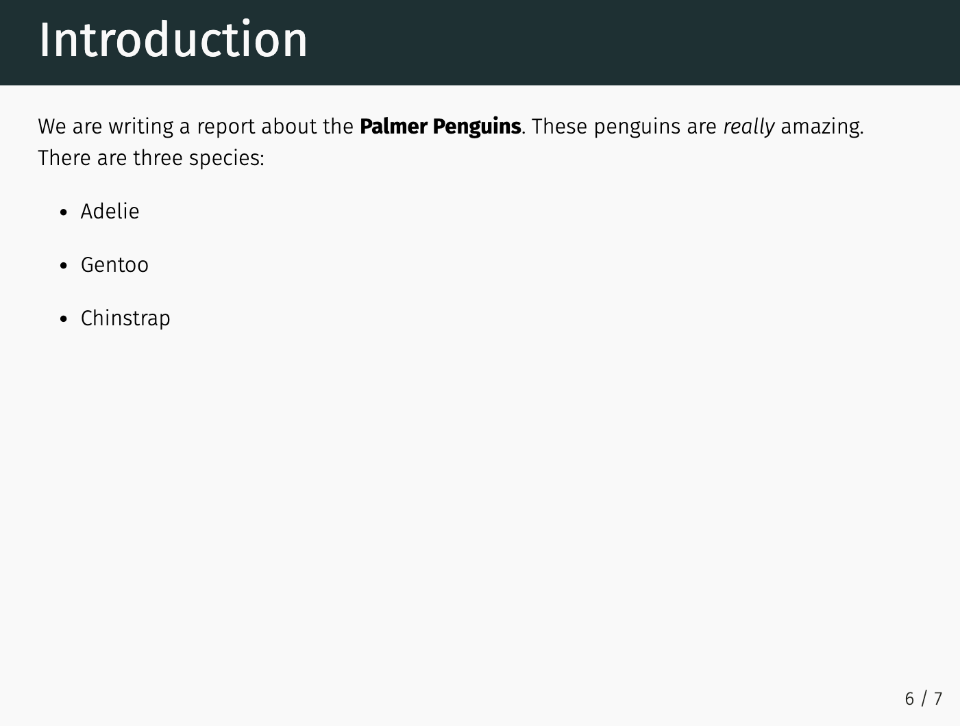
# Introduction

We are writing a report about the **Palmer Penguins**. These penguins are *really* amazing. There are three species:

- Adelie

--

- Gentoo

--

- Chinstrap
This code lets you show Adelie onscreen first; then Adelie and Gentoo; and then Adelie, Gentoo, and Chinstrap. When presenting your slides, use the right arrow to incrementally reveal the species.
Aligning Content with Content Classes
You’ll also likely want to control how your content is aligned. To do so, you add the content classes .left[], right[], and center[] to specify the desired alignment for a piece of content. For example, to center-align the histogram, use .center[] as follows:
.center[
```{r fig.height = 4}
penguins %>%
  ggplot(aes(x = bill_length_mm)) +
  geom_histogram() +
  theme_minimal()
```
]
This code centers the chart on the slide.
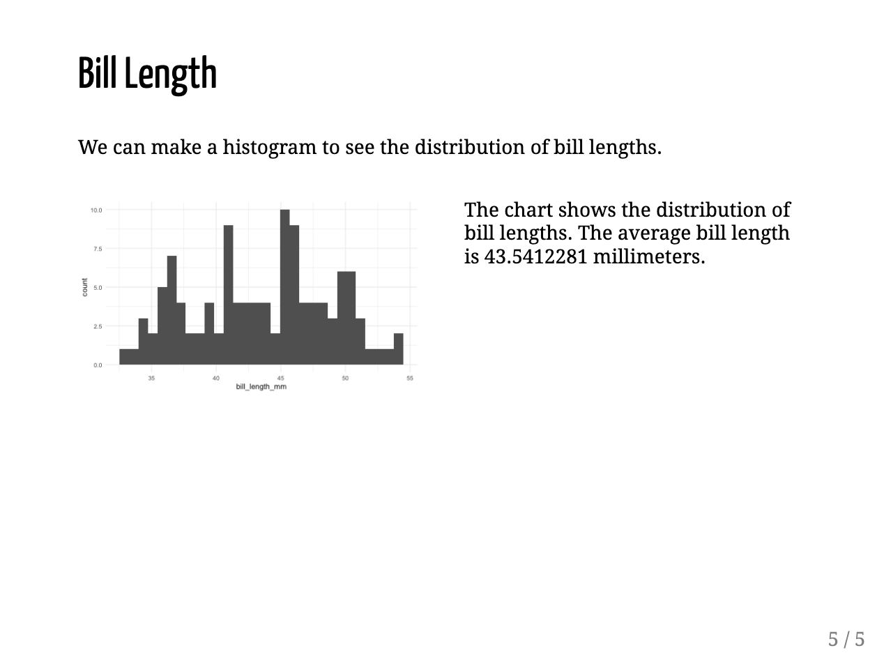
Other built-in options can make two-column layouts. Adding .pull-left[] and .pull-right[] will make two equally spaced columns. Use the following code to display the histogram on the left side of the slide and the accompanying text on the right:
.pull-left[
```{r fig.height = 4}
penguins %>%
  ggplot(aes(x = bill_length_mm)) +
  geom_histogram() +
  theme_minimal()
```
]

.pull-right[
```{r}
average_bill_length <- penguins %>%
  summarize(avg_bill_length = mean(bill_length_mm,
                                   na.rm = TRUE)) %>%
  pull(avg_bill_length)
```

The chart shows the distribution of bill lengths. The average bill length is `r average_bill_length` millimeters.
]
Figure 8.3 shows the result.
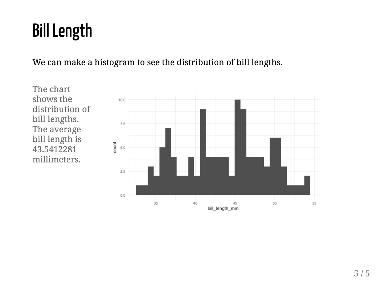
To make a narrow left column and wide right column, use the content classes .left-column[] and .right-column[]. Figure 8.4 shows what the slide looks like with the text on the left and the histogram on the right.
In addition to aligning particular pieces of content on slides, you can also horizontally align the entire content using the left, right, and center classes. To do so, specify the class right after the three dashes that indicate a new slide, but before any content:
---
class: center

## Bill Length

We can make a histogram to see the distribution of bill lengths.

```{r fig.height = 4}
penguins %>%
  ggplot(aes(x = bill_length_mm)) +
  geom_histogram() +
  theme_minimal()
```

```{r}
average_bill_length <- penguins %>%
  summarize(avg_bill_length = mean(bill_length_mm,
                                   na.rm = TRUE)) %>%
  pull(avg_bill_length)
```

The chart shows the distribution of bill lengths. The average bill length is `r average_bill_length` millimeters.
This code produces a horizontally centered slide. To adjust the vertical position, you can use the classes top, middle, and bottom.
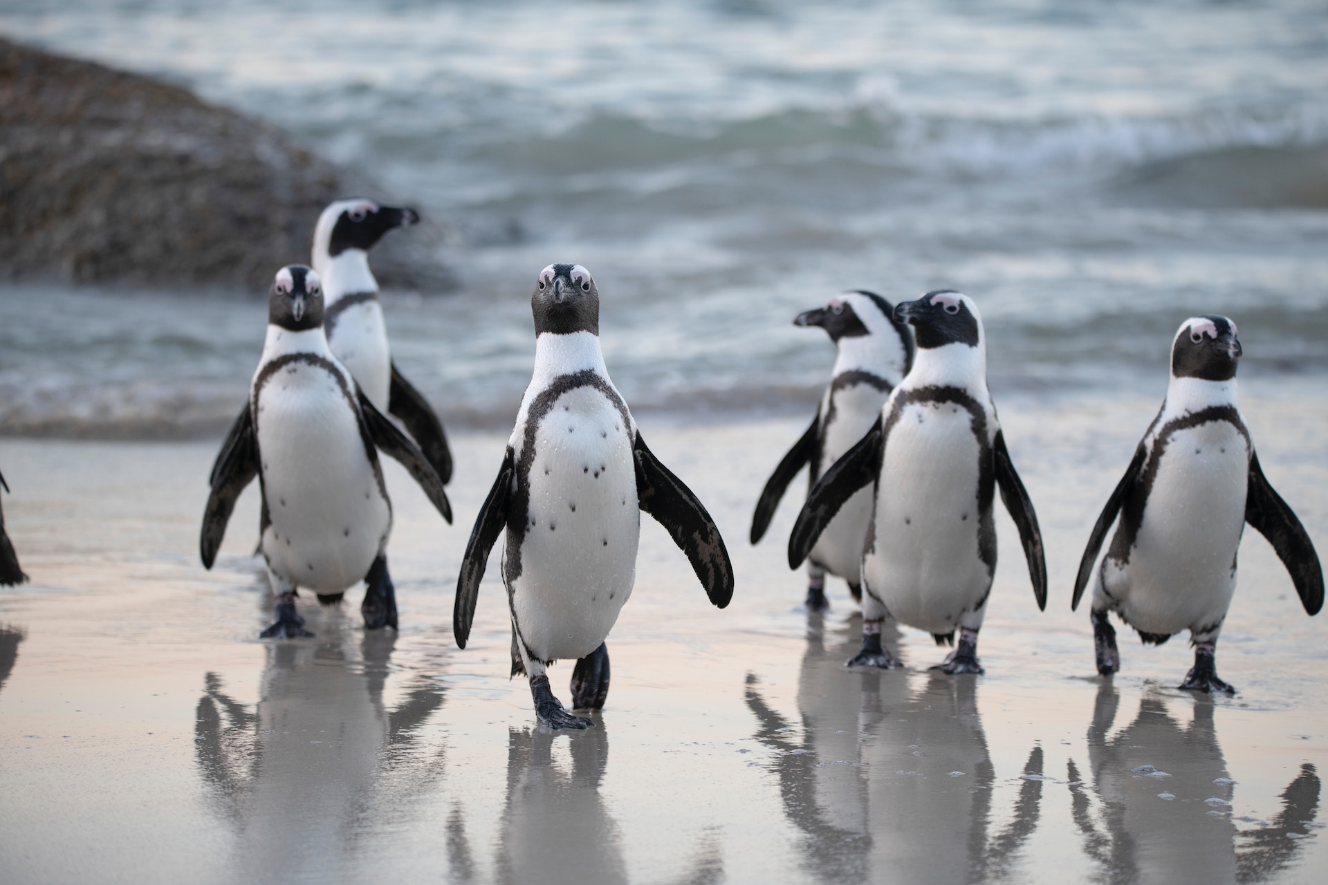
Adding Background Images to Slides
Using the same syntax you just used to center the entire slide, you can also add a background image. Create a new slide, use the classes center and middle to horizontally and vertically align the content, and add a background image by specifying the path to the image within the parentheses of url():
class: center, middle
background-image: url("penguins.jpg")

## Penguins
To run this code, you’ll need a file called penguins.jpg in your project (you can download it at https://data.rfortherestofus.com/penguins.jpg). Knitting the document should produce a slide that uses this image as a background with the text Penguins in front of it, as shown in Figure 8.5.
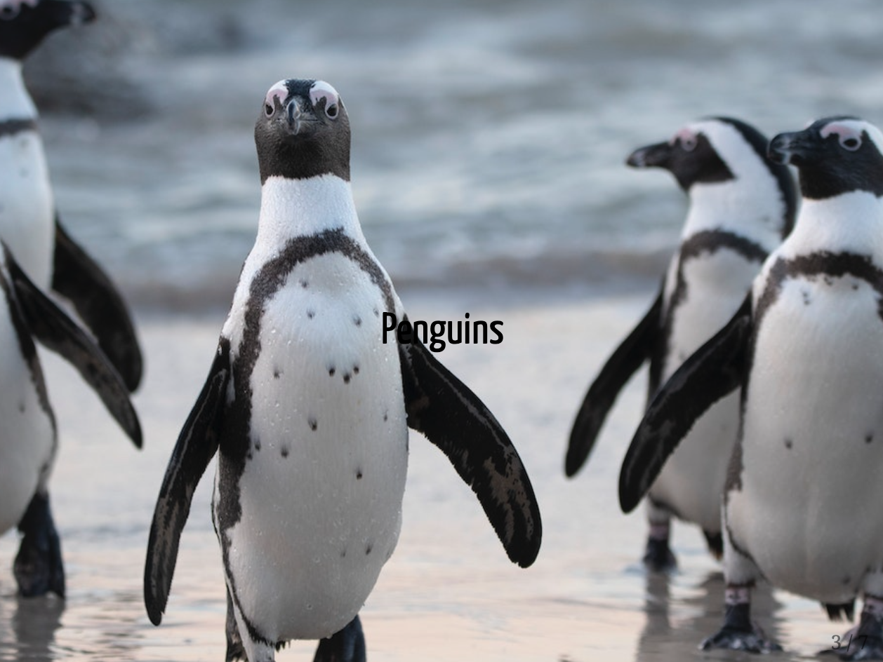
Now you’ll add custom CSS to further improve this slide.
Applying CSS to Slides
One issue with the slide you just made is that the word Penguins is hard to read. It would be better if you could make the text bigger and a different color. To do this, you’ll need to use Cascading Style Sheets (CSS), the language used to style HTML documents. If you’re thinking, I’m reading this book to learn R, not CSS, don’t worry: you’ll need only a bit of CSS to make tweaks to your slides. To apply them, you can write your own custom code, use a CSS theme, or combine the two approaches using the xaringanthemer package.
Custom CSS
To add custom CSS, create a new code chunk and place css between the curly brackets:
```{css}
.remark-slide-content h2 {
  font-size: 150px;
  color: white;
}
```
This code chunk tells R Markdown to make the second-level header (h2) 150 pixels large and white. Adding .remark-slide-content before the header targets specific elements in the presentation. The term remark comes from remark.js, a JavaScript library for making presentations that xaringan uses under the hood.
To change the font in addition to the text’s size and color, add this CSS:
```{css}
@import url('https://fonts.googleapis.com/css2?family=Inter:wght@400;700&display=swap');

.remark-slide-content h2 {
  font-size: 150px;
  color: white;
    font-family: Inter;
  font-weight: bold;
}
```
The first new line makes a font called Inter available to the slides, because some people might not have the font installed on their computers. Next, this code applies Inter to the header and makes it bold. You can see the slide with bold Inter font in Figure 8.6.

Because xaringan slides are built as HTML documents, you can customize them with CSS however you’d like. The sky’s the limit!
Themes
You may not care to know the ins and outs of CSS. Fortunately, you can customize your slides in two ways without writing any CSS yourself. The first way is to apply xaringan themes created by other R users. Run this code to get a list of all available themes:
names(xaringan:::list_css())The output should look something like this:
 [1] "chocolate-fonts"  "chocolate"        "default-fonts"    "default"
 [5] "duke-blue"        "fc-fonts"         "fc"               "glasgow_template"
 [9] "hygge-duke"       "hygge"            "ki-fonts"         "ki"
[13] "kunoichi"         "lucy-fonts"       "lucy"             "metropolis-fonts"
[17] "metropolis"       "middlebury-fonts" "middlebury"       "nhsr-fonts"
[21] "nhsr"             "ninjutsu"         "rladies-fonts"    "rladies"
[25] "robot-fonts"      "robot"            "rutgers-fonts"    "rutgers"
[29] "shinobi"          "tamu-fonts"       "tamu"             "uio-fonts"
[33] "uio"              "uo-fonts"         "uo"               "uol-fonts"
[37] "uol"              "useR-fonts"       "useR"             "uwm-fonts"
[41] "uwm"              "wic-fonts"        "wic"
Some CSS files change fonts only, while others change general elements, such as text size, colors, and whether slide numbers are displayed. Using prebuilt themes usually requires you to use both a general theme and a fonts theme, as follows:
---
title: "Penguins Report"
author: "David Keyes"
date: "2024-01-12"
output:
  xaringan::moon_reader:
    css: [default, metropolis, metropolis-fonts]
---
This code tells xaringan to use the default CSS, as well as customizations made in the metropolis and metropolis-fonts CSS themes. These come bundled with xaringan, so you don’t need to install any additional packages to access them. Figure 8.7 shows how the theme changes the look and feel of the slides.
If writing custom CSS is the totally flexible but more challenging option for tweaking your xaringan slides, then using a custom theme is simpler but a lot less flexible. Custom themes allow you to easily use others’ prebuilt CSS but not to tweak it further.
The xaringanthemer Package
A nice middle ground between writing custom CSS and applying someone else’s theme is to use the xaringanthemer package by Garrick Aden-Buie. This package includes several built-in themes but also allows you to easily create your own custom theme. After installing the package, adjust the css line in your YAML to use the xaringan-themer.css file like so:
---
title: "Penguins Report"
author: "David Keyes"
date: "2024-01-12"
output:
  xaringan::moon_reader:
    css: xaringan-themer.css
---
Now you can customize your slides by using the style_xaringan() function. This function has over 60 arguments, enabling you to tweak nearly any part of your xaringan slides. To replicate the custom CSS you wrote earlier in this chapter using xaringanthemer, you’ll use just a few of the arguments:
```{r}
library(xaringanthemer)

style_xaringan(
  header_h2_font_size = "150px",
  header_color = "white",
  header_font_weight = "bold",
  header_font_family = "Inter"
)
```
This code sets the header size to 150 pixels and makes all the headers use the bold, white Inter font.
One particularly nice thing about the xaringanthemer package is that you can use any font available on Google Fonts by simply adding its name to header_font_family or another argument that sets font families (text_font_family and code_font_family are the other two, for styling body text and code, respectively). This means you won’t have to include the line that makes the Inter font available.
Summary
In this chapter, you learned how to create presentations using the xaringan package. You saw how to incrementally reveal content on slides, create multi-column layouts, and add background images to slides. You also changed your slides’ appearance by applying custom themes, writing your own CSS, and using the xaringanthemer package.
With xaringan, you can create any type of presentation you want and then customize it to match your desired look and feel. Creating presentations with xaringan also allows you to share your HTML slides easily and enables greater accessibility.
Additional Resources
Garrick Aden-Buie, Silvia Canelón, and Shannon Pileggi, “Professional, Polished, Presentable: Making Great Slides with xaringan,” workshop materials, n.d., https://presentable-user2021.netlify.app.
Silvia Canelón, “Sharing Your Work with xaringan: An Introduction to xaringan for Presentations: The Basics and Beyond,” workshop for the NHS-R Community 2020 Virtual Conference, November 2, 2020, https://spcanelon.github.io/xaringan-basics-and-beyond/index.html.
Alison Hill, “Meet xaringan: Making Slides in R Markdown,” slideshow presentation, January 16, 2019, https://arm.rbind.io/slides/xaringan.html.
Yihui Xie, J. J. Allaire, and Garrett Grolemund, “xaringan Presentations,” in R Markdown: The Definitive Guide (Boca Raton, FL: CRC Press, 2019), https://bookdown.org/yihui/rmarkdown/.