4 Maps and Geospatial Data
You are reading the free online version of this book. If you’d like to purchase a physical or electronic copy, you can buy it from No Starch Press, Powell’s, Barnes and Noble or Amazon.
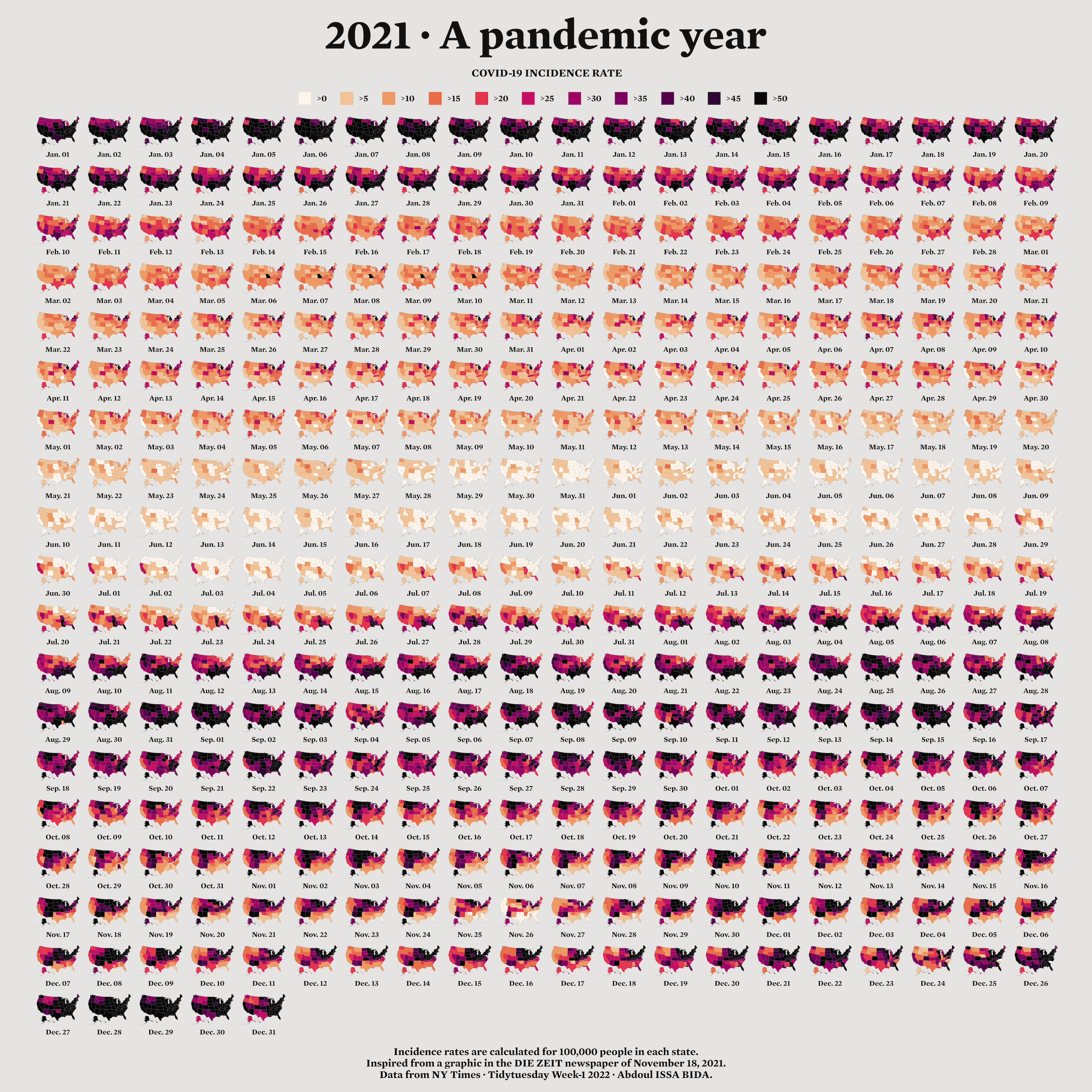
When I first started learning R, I considered it a tool for working with numbers, not shapes, so I was surprised when I saw people using it to make maps. For example, developer Abdoul Madjid used R to make a map that visualizes rates of COVID-19 in the United States in 2021.
You might think you need specialized mapmaking software like ArcGIS to make maps, but it’s an expensive tool. And while Excel has added support for mapmaking in recent years, its features are limited (for example, you can’t use it to make maps based on street addresses). Even QGIS, an open source tool similar to ArcGIS, still requires learning new skills.
Using R for mapmaking is more flexible than using Excel, less expensive than using ArcGIS, and based on syntax you already know. It also lets you perform all of your data manipulation tasks with one tool and apply the principles of high-quality data visualization discussed in Chapter 2. In this chapter, you’ll work with simple features of geospatial data and examine Madjid’s code to understand how he created this map. You’ll also learn where to find geospatial data and how to use it to make your own maps.
A Brief Primer on Geospatial Data
You don’t need to be a GIS expert to make maps, but you do need to understand a few things about how geospatial data works, starting with its two main types: vector and raster. Vector data uses points, lines, and polygons to represent the world. Raster data, which often comes from digital photographs, ties each pixel in an image to a specific geographic location. Vector data tends to be easier to work with, and you’ll be using it exclusively in this chapter.
In the past, working with geospatial data meant mastering competing standards, each of which required learning a different approach. Today, though, most people use the simple features model (often abbreviated as sf) for working with vector geospatial data, which is easier to understand. For example, to import simple features data about the state of Wyoming, enter the following:
And then you can look at the data like so:
wyomingSimple feature collection with 1 feature and 1 field
Geometry type: POLYGON
Dimension: XY
Bounding box: xmin: -111.0546 ymin: 40.99477 xmax: -104.0522 ymax: 45.00582
Geodetic CRS: WGS 84
# A tibble: 1 × 2
NAME geometry
<chr> <POLYGON [°]>
1 Wyoming ((-106.3212 40.99912, -106.3262 40.99927, -106.3265 40.99927, -106.33…The output has two columns, one for the state name (NAME) and another called geometry. This data looks like the data frames you’ve seen before, aside from two major differences.
First, there are five lines of metadata above the data frame. At the top is a line stating that the data contains one feature and one field. A feature is a row of data, and a field is any column containing nonspatial data. Second, the simple features data contains geographical data in a variable called geometry. Because the geometry column must be present for a data frame to be geospatial data, it isn’t counted as a field. Let’s look at each part of this simple features data.
The Geometry Type
The geometry type represents the shape of the geospatial data you’re working with and is typically shown in all caps. In this case, the relatively simple POLYGON type represents a single polygon. You can use ggplot to display this data by calling geom_sf(), a special geom designed to work with simple features data:
Figure 4.1 shows the resulting map of Wyoming. It may not look like much, but I wasn’t the one who made Wyoming a nearly perfect rectangle!

POLYGON simple features data
Other geometry types used in simple features data include POINT, to display elements such as a pin on a map that represents a single location. For example, the map in Figure 4.2 uses POINT data to show a single electric vehicle charging station in Wyoming.

POINT simple features data
The LINESTRING geometry type is for a set of points that can be connected with lines and is often used to represent roads. Figure 4.3 shows a map that uses LINESTRING data to represent a section of US Highway 30 that runs through Wyoming.

LINESTRING simple features data
Each of these geometry types has a MULTI variation (MULTIPOINT, MULTILINESTRING, and MULTIPOLYGON) that combines multiple instances of the type in one row of data. For example, Figure 4.4 uses MULTIPOINT data to show all electric vehicle charging stations in Wyoming.

MULTIPOINT data to represent multiple electric vehicle charging stations
Likewise, you can use MULTILINESTRING data to show not just one road but all major roads in Wyoming (Figure 4.5).

Finally, you could use MULTIPOLYGON data, for example, to depict a state made up of multiple polygons. The following data represents the 23 counties in the state of Wyoming:
Simple feature collection with 23 features and 1 field
Geometry type: MULTIPOLYGON
Dimension:     XY
Bounding box:  xmin: -111.0546 ymin: 40.99477 xmax: -104.0522 ymax: 45.00582
Geodetic CRS:  WGS 84
# A tibble: 23 × 2
   NAME                                                                 geometry
   <chr>                                                      <MULTIPOLYGON [°]>
 1 Lincoln     (((-110.5417 42.28652, -110.5417 42.28638, -110.5417 42.28471, -…
 2 Fremont     (((-109.3258 42.86878, -109.3258 42.86894, -109.3261 42.86956, -…
 3 Uinta       (((-110.5849 41.57916, -110.5837 41.57916, -110.5796 41.57917, -…
 4 Big Horn    (((-107.5034 44.64004, -107.5029 44.64047, -107.5023 44.64078, -…
 5 Hot Springs (((-108.1563 43.47063, -108.1563 43.45961, -108.1564 43.45961, -…
 6 Washakie    (((-107.6841 44.1664, -107.684 44.1664, -107.684 44.1664, -107.6…
 7 Converse    (((-105.9232 43.49501, -105.9152 43.49503, -105.9072 43.49505, -…
 8 Sweetwater  (((-109.5651 40.99839, -109.5652 40.99839, -109.5656 40.99839, -…
 9 Crook       (((-104.4611 44.18075, -104.4612 44.18075, -104.4643 44.18075, -…
10 Carbon      (((-106.3227 41.38265, -106.3227 41.38245, -106.3227 41.38242, -…
# ℹ 13 more rows
As you can see on the second line, the geometry type of this data is MULTIPOLYGON. In addition, the repeated MULTIPOLYGON text in the geometry column indicates that each row contains a shape of type MULTIPOLYGON. Figure 4.6 shows a map made with this data.

Notice that the map is made up entirely of polygons.
The Dimensions
Next, the geospatial data frame contains the data’s dimensions, or the type of geospatial data you’re working with. In the Wyoming example, it looks like Dimension: XY, meaning the data is two-dimensional, as in the case of all the geospatial data used in this chapter. There are two other dimensions (Z and M) that you’ll see much more rarely. I’ll leave them for you to investigate further.
Bounding Box
The penultimate element in the metadata is the bounding box, which represents the smallest area in which you can fit all of your geospatial data. For the wyoming object, it looks like this:
Bounding box: xmin: -111.0569 ymin: 40.99475 xmax: -104.0522 ymax: 45.0059The ymin value of 40.99475 and ymax value of 45.0059 represent the lowest and highest latitudes, respectively, that the state’s polygon can fit into. The x-values do the same for the longitude. Bounding boxes are calculated automatically, and typically you don’t have to worry about altering them.
The Coordinate Reference System
The last piece of metadata specifies the coordinate reference system used to project the data when it’s plotted. The challenge with representing any geospatial data is that you’re displaying information about the three-dimensional Earth on a two-dimensional map. Doing so requires choosing a coordinate reference system that determines what type of correspondence, or projection, to use when making the map.
The data for the Wyoming counties map includes the line Geodetic CRS: WGS 84, indicating the use of a coordinate reference system known as WGS84. To see a different projection, check out the same map using the Albers equal-area conic convenience projection. While Wyoming looked perfectly horizontal in Figure 4.6, the version in Figure 4.7 appears to be tilted.

If you’re wondering how to change projections when making maps of your own, fear not: you’ll see how to do this when we look at Madjid’s map in the next section. And if you want to know how to choose appropriate projections for your maps, check out “Using Appropriate Projections” (Section 4.3.3).
The geometry Column
In addition to the metadata, simple features data differs from traditional data frames in another respect: its geometry column. As you might have guessed from the name, this column holds the data needed to draw the maps.
To understand how this works, consider the connect-the-dots drawings you probably completed as a kid. As you added lines to connect one point to the next, the subject of your drawing became clearer. The geometry column is similar. It has a set of numbers, each of which corresponds to a point. If you’re using LINESTRING/MULTILINESTRING or POLYGON/MULTIPOLYGON simple features data, ggplot uses the numbers in the geometry column to draw each point and then adds lines to connect the points. If you’re using POINT/MULTIPOINT data, it draws the points but doesn’t connect them.
Once again, thanks to R, you never have to worry about these details or look in any depth at the geometry column.
Re-creating the COVID Map
Now that you understand the basics of geospatial data, let’s walk through the code Madjid used to make his COVID-19 map. Shown in Figure 4-8, it makes use of the geometry types, dimensions, bounding boxes, projections, and the geometry column just discussed.
I’ve made some small modifications to the code to make the final map fit on the page. You’ll begin by loading a few packages1:
You can install all of the packages using the standard install.packages() code. You’ll use the tidyverse to import data, manipulate it, and plot it with ggplot. The data itself will come from the tigris package. The sf package will enable you to change the coordinate reference system and use an appropriate projection for the data. The zoo package has functions for calculating rolling averages, and the colorspace package gives you a color scale that highlights the data well. The janitor package gives you a function called clean_names() that makes variable names easier to work with in R.
Importing the Data
Next, you’ll import the data you need: COVID-19 rates by state over time, state populations, and geospatial information. Madjid imported each of these pieces of data separately and then merged them, and you’ll do the same.
The COVID-19 data comes directly from the New York Times, which publishes daily case rates by state as a CSV file on its GitHub account. To import it, enter the following:
Federal Information Processing Standards (FIPS) are numeric codes used to represent states, but you’ll reference states by their names instead, so the line select(-fips) drops the fips variable.
Looking at this data, you can see the arrival of the first COVID-19 cases in the United States in January 2020:
# A tibble: 61,102 × 4
   date       state      cases deaths
   <date>     <chr>      <dbl>  <dbl>
 1 2020-01-21 Washington     1      0
 2 2020-01-22 Washington     1      0
 3 2020-01-23 Washington     1      0
 4 2020-01-24 Illinois       1      0
 5 2020-01-24 Washington     1      0
 6 2020-01-25 California     1      0
 7 2020-01-25 Illinois       1      0
 8 2020-01-25 Washington     1      0
 9 2020-01-26 Arizona        1      0
10 2020-01-26 California     2      0
# ℹ 61,092 more rows
Madjid’s map shows per capita rates (the rates per 100,000 people) rather than absolute rates (the rates without consideration for a state’s population). So, to re-create his maps, you also need to obtain data on each state’s population. Download this data as a CSV as follows:
This code imports the data, keeps the State and Pop (population) variables, and saves the data as an object called usa_states. Here’s what usa_states looks like:
# A tibble: 52 × 2
   State               Pop
   <chr>             <dbl>
 1 California     39613493
 2 Texas          29730311
 3 Florida        21944577
 4 New York       19299981
 5 Pennsylvania   12804123
 6 Illinois       12569321
 7 Ohio           11714618
 8 Georgia        10830007
 9 North Carolina 10701022
10 Michigan        9992427
# ℹ 42 more rows
Finally, import the geospatial data and save it as an object called usa_states_geom like so:
usa_states_geom <- states(
   cb = TRUE,
   resolution = "20m",
   progress_bar = FALSE
) %>%
  shift_geometry() %>%
  clean_names() %>%
  select(name)
The states() function from the tigris package gives you simple features data for all US states. The cb = TRUE argument opts out of using the most detailed shapefile and sets the resolution to a more manageable 20m (1:20 million). Without these changes, the resulting shapefile would be large and slow to work with. Setting progress_bar = FALSE hides the messages that tigris generates as it loads data. Conveniently, the shift_geometry() function places Alaska and Hawaii at a position and scale that make them easy to see. The clean_names() function makes all variable names lower case. This data includes multiple variables, but because you need only the state names, this code keeps just the name variable.
Calculating Daily COVID-19 Cases
The covid_data data frame lists cumulative COVID-19 cases by state, but not the number of cases per day, so the next step is to calculate that number:
The group_by() function calculates totals for each state, then creates a new variable called pd_cases, which represents the number of cases in the previous day (the lag() function is used to assign data to this variable). Some days don’t have case counts for the previous day, so set this value to 0 using the replace_na() function.
Next, this code creates a new variable called daily_cases. To set the value of this variable, use the case_when() function to create a condition: if the cases variable (which holds the cases on that day) is greater than the pd_cases variable (which holds cases from one day prior), then daily_cases is equal to cases minus pd_cases. Otherwise, you set daily_cases to be equal to 0.
Finally, because you grouped the data by state at the beginning of the code, now you need to remove this grouping using the ungroup() function before arranging the data by state and date.
Here’s the resulting covid_cases data frame:
# A tibble: 61,102 × 6
   date       state   cases deaths pd_cases daily_cases
   <date>     <chr>   <dbl>  <dbl>    <dbl>       <dbl>
 1 2020-03-13 Alabama     6      0        0           6
 2 2020-03-14 Alabama    12      0        6           6
 3 2020-03-15 Alabama    23      0       12          11
 4 2020-03-16 Alabama    29      0       23           6
 5 2020-03-17 Alabama    39      0       29          10
 6 2020-03-18 Alabama    51      0       39          12
 7 2020-03-19 Alabama    78      0       51          27
 8 2020-03-20 Alabama   106      0       78          28
 9 2020-03-21 Alabama   131      0      106          25
10 2020-03-22 Alabama   157      0      131          26
# ℹ 61,092 more rows
In the next step, you’ll make use of the new daily_cases variable.
Calculating Incidence Rates
You’re not quite done calculating values. The data that Madjid used to make his map didn’t include daily case counts. Instead, it contained a five-day rolling average of cases per 100,000 people. A rolling average is the average case rate in a certain time period. Quirks of reporting (for example, not reporting on weekends but instead rolling Saturday and Sunday cases into Monday) can make the value for any single day less reliable. Using a rolling average smooths out these quirks. Generate this data as follows:
This code creates a new data frame called covid_cases_rm (where rm stands for rolling mean). The first step in its creation is to use the rollmean() function from the zoo package to create a roll_cases variable, which holds the average number of cases in the five-day period surrounding a single date. The k argument is the number of days for which you want to calculate the rolling average (5, in this case), and the fill argument determines what happens in cases like the first day, where you can’t calculate a five-day rolling mean because there are no days prior to this day (Madjid set these values to NA).
After calculating roll_cases, you need to calculate per capita case rates. To do this, you need population data, so join the population data from the usa_states data frame with the covid_cases data like so:
To drop rows with missing population data, you call the drop_na() function with the Pop variable as an argument. In practice, this removes several US territories (American Samoa, Guam, the Northern Mariana Islands, and the Virgin Islands).
Next, you create a per capita case rate variable called incidence_rate by multiplying the roll_cases variable by 100,000 and then dividing it by the population of each state:
Rather than keeping raw values (for example, on June 29, 2021, Florida had a rate of 57.77737 cases per 100,000 people), you use the cut() function to convert the values into categories: values of >0 (greater than zero), values of >5 (greater than five), and values of >50 (greater than 50).
The last step is to filter the data so it includes only 2021 data (the only year depicted in Madjid’s map) and then select just the variables (state, date, and incidence_rate) you’ll need to create the map:
Here’s the final covid_cases_rm data frame:
# A tibble: 18,980 × 3
   state   date       incidence_rate
   <chr>   <date>     <fct>
 1 Alabama 2021-01-01 >50
 2 Alabama 2021-01-02 >50
 3 Alabama 2021-01-03 >50
 4 Alabama 2021-01-04 >50
 5 Alabama 2021-01-05 >50
 6 Alabama 2021-01-06 >50
 7 Alabama 2021-01-07 >50
 8 Alabama 2021-01-08 >50
 9 Alabama 2021-01-09 >50
10 Alabama 2021-01-10 >50
# ℹ 18,970 more rows
You now have a data frame that you can combine with your geospatial data.
Adding Geospatial Data
You’ve used two of the three data sources (COVID-19 case data and state population data) to create the covid_cases_rm data frame you’ll need to make the map. Now it’s time to use the third data source: the geospatial data you saved as usa_states_geom. Simple features data allows you to merge regular data frames and geospatial data (another point in its favor):
This code merges the covid_cases_rm data frame into the geospatial data, matching the name variable from usa_states_geom to the state variable in covid_cases_rm.
Next, you create a new variable called fancy_date to format the date nicely (for example, Jan. 01 instead of 2021-01-01):
The format() function does the formatting, while the fct_inorder() function makes the fancy_date variable sort data by date (rather than, say, alphabetically, which would put August before January). Last, the relocate() function puts the fancy_date column next to the date column.
Save this data frame as usa_states_geom_covid and take a look at the result:
Simple feature collection with 18980 features and 4 fields
Geometry type: MULTIPOLYGON
Dimension:     XY
Bounding box:  xmin: -3112200 ymin: -1697728 xmax: 2258154 ymax: 1558935
Projected CRS: USA_Contiguous_Albers_Equal_Area_Conic
First 10 features:
        name       date fancy_date incidence_rate
1  Louisiana 2021-01-01    Jan. 01            >50
2  Louisiana 2021-01-02    Jan. 02            >45
3  Louisiana 2021-01-03    Jan. 03            >45
4  Louisiana 2021-01-04    Jan. 04            >50
5  Louisiana 2021-01-05    Jan. 05            >50
6  Louisiana 2021-01-06    Jan. 06            >50
7  Louisiana 2021-01-07    Jan. 07            >50
8  Louisiana 2021-01-08    Jan. 08            >50
9  Louisiana 2021-01-09    Jan. 09            >50
10 Louisiana 2021-01-10    Jan. 10            >50
                         geometry
1  MULTIPOLYGON (((182432.3 -5...
2  MULTIPOLYGON (((182432.3 -5...
3  MULTIPOLYGON (((182432.3 -5...
4  MULTIPOLYGON (((182432.3 -5...
5  MULTIPOLYGON (((182432.3 -5...
6  MULTIPOLYGON (((182432.3 -5...
7  MULTIPOLYGON (((182432.3 -5...
8  MULTIPOLYGON (((182432.3 -5...
9  MULTIPOLYGON (((182432.3 -5...
10 MULTIPOLYGON (((182432.3 -5...
You can see the metadata and geometry columns discussed earlier in the chapter.
Making the Map
It took a lot of work to end up with the surprisingly simple usa_states_geom_covid data frame. While the data may be simple, the code Madjid used to make his map is quite complex. This section walks you through it in pieces.
The final map is actually multiple maps, one for each day in 2021. Combining 365 days makes for a large final product, so instead of showing the code for every single day, filter the usa_states_geom_covid to show just the first six days in January:
Save the result as a data frame called usa_states_geom_covid_six_days. Here’s what this data looks like:
Simple feature collection with 312 features and 4 fields
Geometry type: MULTIPOLYGON
Dimension:     XY
Bounding box:  xmin: -3112200 ymin: -1697728 xmax: 2258154 ymax: 1558935
Projected CRS: USA_Contiguous_Albers_Equal_Area_Conic
First 10 features:
        name       date fancy_date incidence_rate
1  Louisiana 2021-01-01    Jan. 01            >50
2  Louisiana 2021-01-02    Jan. 02            >45
3  Louisiana 2021-01-03    Jan. 03            >45
4  Louisiana 2021-01-04    Jan. 04            >50
5  Louisiana 2021-01-05    Jan. 05            >50
6  Louisiana 2021-01-06    Jan. 06            >50
7   Maryland 2021-01-01    Jan. 01            >45
8   Maryland 2021-01-02    Jan. 02            >45
9   Maryland 2021-01-03    Jan. 03            >40
10  Maryland 2021-01-04    Jan. 04            >40
                         geometry
1  MULTIPOLYGON (((182432.3 -5...
2  MULTIPOLYGON (((182432.3 -5...
3  MULTIPOLYGON (((182432.3 -5...
4  MULTIPOLYGON (((182432.3 -5...
5  MULTIPOLYGON (((182432.3 -5...
6  MULTIPOLYGON (((182432.3 -5...
7  MULTIPOLYGON (((1722285 240...
8  MULTIPOLYGON (((1722285 240...
9  MULTIPOLYGON (((1722285 240...
10 MULTIPOLYGON (((1722285 240...
Madjid’s map is giant, as it includes all 365 days. The size of a few elements have been changed so that they fit in this book.
Generating the Basic Map
With your six days of data, you’re ready to make some maps. Madjid’s map-making code has two main parts: generating the basic map, then tweaking its appearance. First, you’ll revisit the three lines of code used to make the Wyoming maps, with some adornments to improve the quality of the visualization:
The geom_sf() function plots the geospatial data, modifying a couple of arguments: size = .05 makes the state borders less prominent and color = "grey55" sets them to a medium-gray color. Then, the facet_wrap() function is used for the faceting (that is, to make one map for each day). The vars(fancy _date) code specifies that the fancy_date variable should be used for the faceted maps, and strip.position = "bottom" moves the labels Jan. 01, Jan. 02, and so on to the bottom of the maps. Figure Figure 4.9 shows the result.

Having generated the basic map, let’s now make it look good.
Applying Data Visualization Principles
From now on, all of the code that Madjid uses is to improve the appearance of the maps. Many of the tweaks shown here should be familiar if you’ve read Chapter 2, highlighting a benefit of making maps with ggplot: you can apply the same data visualization principles you learned about when making charts.
usa_states_geom_covid_six_days %>%
  ggplot() +
  geom_sf(
    aes(fill = incidence_rate),
    size = .05,
    color = "transparent"
  ) +
  facet_wrap(
    vars(fancy_date),
    strip.position = "bottom"
  ) +
  scale_fill_discrete_sequential(
    palette = "Rocket",
    name = "COVID-19 INCIDENCE RATE",
    guide = guide_legend(
      title.position = "top",
      title.hjust = .5,
      title.theme = element_text(
        family = "Times New Roman",
        size = rel(9),
        margin = margin(
          b = .1,
          unit = "cm"
        )
      ),
      nrow = 1,
      keyheight = unit(.3, "cm"),
      keywidth = unit(.3, "cm"),
      label.theme = element_text(
        family = "Times New Roman",
        size = rel(6),
        margin = margin(
          r = 5,
          unit = "pt"
        )
      )
    )
  ) +
  labs(
    title = "2021 · A pandemic year",
    caption = "Incidence rates are calculated for 100,000 people in each state.
                  Inspired from a graphic in the DIE ZEIT newspaper of November 18, 2021.
                  Data from NY Times · Tidytuesday Week-1 2022 · Abdoul ISSA BIDA."
  ) +
  theme_minimal() +
  theme(
    text = element_text(
      family = "Times New Roman",
      color = "#111111"
    ),
    plot.title = element_text(
      size = rel(2.5),
      face = "bold",
      hjust = 0.5,
      margin = margin(
        t = .25,
        b = .25,
        unit = "cm"
      )
    ),
    plot.caption = element_text(
      hjust = .5,
      face = "bold",
      margin = margin(
        t = .25,
        b = .25,
        unit = "cm"
      )
    ),
    strip.text = element_text(
      size = rel(0.75),
      face = "bold"
    ),
    legend.position = "top",
    legend.box.spacing = unit(.25, "cm"),
    panel.grid = element_blank(),
    axis.text = element_blank(),
    plot.margin = margin(
      t = .25,
      r = .25,
      b = .25,
      l = .25,
      unit = "cm"
    ),
    plot.background = element_rect(
      fill = "#e5e4e2",
      color = NA
    )
  )
The scale_fill_discrete_sequential() function, from the colorspace package, sets the color scale. This code uses the rocket palette (the same palette that Cédric Scherer and Georgios Karamanis used in Chapter 2) and changes the legend title to “COVID-19 INCIDENCE RATE.” The guide_legend() function adjusts the position, alignment, and text properties of the title. The code then puts the colored squares in one row, adjusts their height and width, and tweaks the text properties of the labels (>0, >5, and so on).
Next, the labs() function adds a title and caption. Following theme_minimal(), the theme() function makes some design tweaks, including setting the font and text color; making the title and caption bold; and adjusting their size, alignment, and margins. The code then adjusts the size of the strip text (Jan. 01, Jan. 02, and so on) and makes it bold, puts the legend at the top of the maps, and adds a bit of spacing around it. Grid lines, as well as the longitude and latitude lines, are removed, and then the entire visualization gets a bit of padding and a light gray background.
There you have it! Figure 4.10 shows the re-creation of his COVID-19 map.

From data import and data cleaning to analysis and visualization, you’ve seen how Madjid made a beautiful map in R.
Making Your Own Maps
You may now be wondering, Okay, great, but how do I actually make my own maps? In this section you’ll learn where you can find geospatial data, how to choose a projection, and how to prepare the data for mapping.
There are two ways to access simple features geospatial data. The first is to import raw data, and the second is to access it with R functions.
Importing Raw Data
Geospatial data can come in various formats. While ESRI shapefiles (with the .shp extension) are the most common, you might also encounter GeoJSON files (.geojson) like the ones we used in the Wyoming example at the beginning of this chapter, KML files (.kml), and others. Chapter 8 of Geocomputation with R by Robin Lovelace, Jakub Nowosad, and Jannes Muenchow discusses this range of formats.
The good news is that a single function can read pretty much any type of geospatial data: read_sf() from the sf package. Say you’ve downloaded geospatial data about US state boundaries from the website https://geojson.xyz in GeoJSON format, then saved it in the data folder as states.geojson. To import this data, use the read_sf() function like so:
us_states <- read_sf(dsn = "data/states.geojson")The dsn argument (which stands for data source name) tells read_sf() where to find the file. You save the data as the object us_states.
Accessing Geospatial Data Using R Functions
Sometimes you’ll have to work with raw data in this way, but not always. That’s because certain R packages provide functions for accessing geospatial data. You saw earlier how the tigris package can help you access geospatial data on US states. This package also has functions to get geospatial data about counties, census tracts, roads, and more.
If you’re looking for data outside the United States, the rnaturalearth package provides functions for importing geospatial data from across the world. For example, use ne_countries() to retrieve geospatial data about various countries:
library(rnaturalearth)

africa_countries <- ne_countries(
  returnclass = "sf",
  continent = "Africa"
)
This code uses two arguments: returnclass = "sf" to get data in simple features format, and continent = "Africa" to get only countries on the African continent. If you save the result to an object called africa_countries, you can plot the data on a map as follows:
Figure 4.11 shows the resulting map.

rnaturalearth package
If you can’t find an appropriate package, you can always fall back on using read_sf() from the sf package.
Using Appropriate Projections
Once you have access to geospatial data, you need to decide which projection to use. If you’re looking for a simple answer to this question, you’ll be disappointed. As Geocomputation with R puts it, “The question of which CRS [to use] is tricky, and there is rarely a ‘right’ answer.”
If you’re overwhelmed by the task of choosing a projection, the crsuggest package from Kyle Walker can give you ideas. Its suggest_top_crs() function returns a coordinate reference system that is well suited for your data. Load crsuggest and try it out on your africa_countries data:
The suggest_top_crs() function should return projection number 28232. Pass this value to the st_transform() function to change the projection before you plot:
africa_countries %>%
  st_transform(28232) %>%
  ggplot() +
  geom_sf()
When run, this code generates the map in Figure 4.12.

As you can see, you’ve successfully mapped Africa with a different projection.
Wrangling Your Geospatial Data
The ability to merge traditional data frames with geospatial data is a huge benefit of working with simple features data. Remember that for his COVID-19 map, Madjid analyzed traditional data frames before merging them with geospatial data. But because simple features data acts just like traditional data frames, you can just as easily apply the data-wrangling and analysis functions from the tidyverse directly to a simple features object. To see how this works, revisit the africa_countries simple features data and select two variables (name and pop_est) to see the name and population of the countries:
The output looks like the following:
Simple feature collection with 51 features and 2 fields
Geometry type: MULTIPOLYGON
Dimension:     XY
Bounding box:  xmin: -17.62504 ymin: -34.81917 xmax: 51.13387 ymax: 37.34999
Geodetic CRS:  WGS 84
First 10 features:
              name  pop_est                       geometry
2         Tanzania 58005463 MULTIPOLYGON (((33.90371 -0...
3        W. Sahara   603253 MULTIPOLYGON (((-8.66559 27...
12 Dem. Rep. Congo 86790567 MULTIPOLYGON (((29.34 -4.49...
13         Somalia 10192317 MULTIPOLYGON (((41.58513 -1...
14           Kenya 52573973 MULTIPOLYGON (((39.20222 -4...
15           Sudan 42813238 MULTIPOLYGON (((24.56737 8....
16            Chad 15946876 MULTIPOLYGON (((23.83766 19...
26    South Africa 58558270 MULTIPOLYGON (((16.34498 -2...
27         Lesotho  2125268 MULTIPOLYGON (((28.97826 -2...
49        Zimbabwe 14645468 MULTIPOLYGON (((31.19141 -2...
Say you want to make a map showing which African countries have populations larger than 20 million. First, you’ll need to calculate this value for each country. To do so, use the mutate() and if_else() functions, which will return TRUE if a country’s population is over 20 million and FALSE otherwise, and then store the result in a variable called population_above_20_million:
You can then take this code and pipe it into ggplot, setting the fill aesthetic property to be equal to population_above_20_million:
This code generates the map shown in Figure 4-13.

This is a basic example of the data wrangling and analysis you can perform on simple features data. The larger lesson is this: any skill you’ve developed for working with data in R will serve you well when working with geospatial data.
Summary
In this short romp through the world of mapmaking in R, you learned the basics of simple features geospatial data, reviewed how Abdoul Madjid applied this knowledge to make his map, explored how to get your own geospatial data, and saw how to project it appropriately to make your own maps.
R may very well be the best tool for making maps. It also lets you use the skills you’ve developed for working with traditional data frames and the ggplot code to make your visualizations look great. After all, Madjid isn’t a GIS expert, but he combined a basic understanding of geospatial data, fundamental R skills, and knowledge of data visualization principles to make a beautiful map. Now it’s your turn to do the same.
Additional Resources
Kieran Healy, “Draw Maps,” in Data Visualization: A Practical Introduction (Princeton, NJ: Princeton University Press, 2018), https://socviz.co.
Andrew Heiss, “Lessons on Space from Data Visualization: Use R, ggplot2, and the Principles of Graphic Design to Create Beautiful and Truthful Visualizations of Data,” online course, last updated July 11, 2022, https://datavizs22.classes.andrewheiss.com/content/12-content/.
Robin Lovelace, Jakub Nowosad, and Jannes Muenchow, Geocomputation with R (Boca Raton, FL: CRC Press, 2019), https://r.geocompx.org.
Kyle Walker, Analyzing US Census Data: Methods, Maps, and Models in R (Boca Raton, FL: CRC Press, 2023). https://walker-data.com/census-r/
The first print version of the book uses the
albersusapackage. Unfortunately, this package is no longer easily installable. I’ve changed the instructions below to use thetigrispackage.↩︎